Misc
Mapped: Visualizing the True Size of Africa
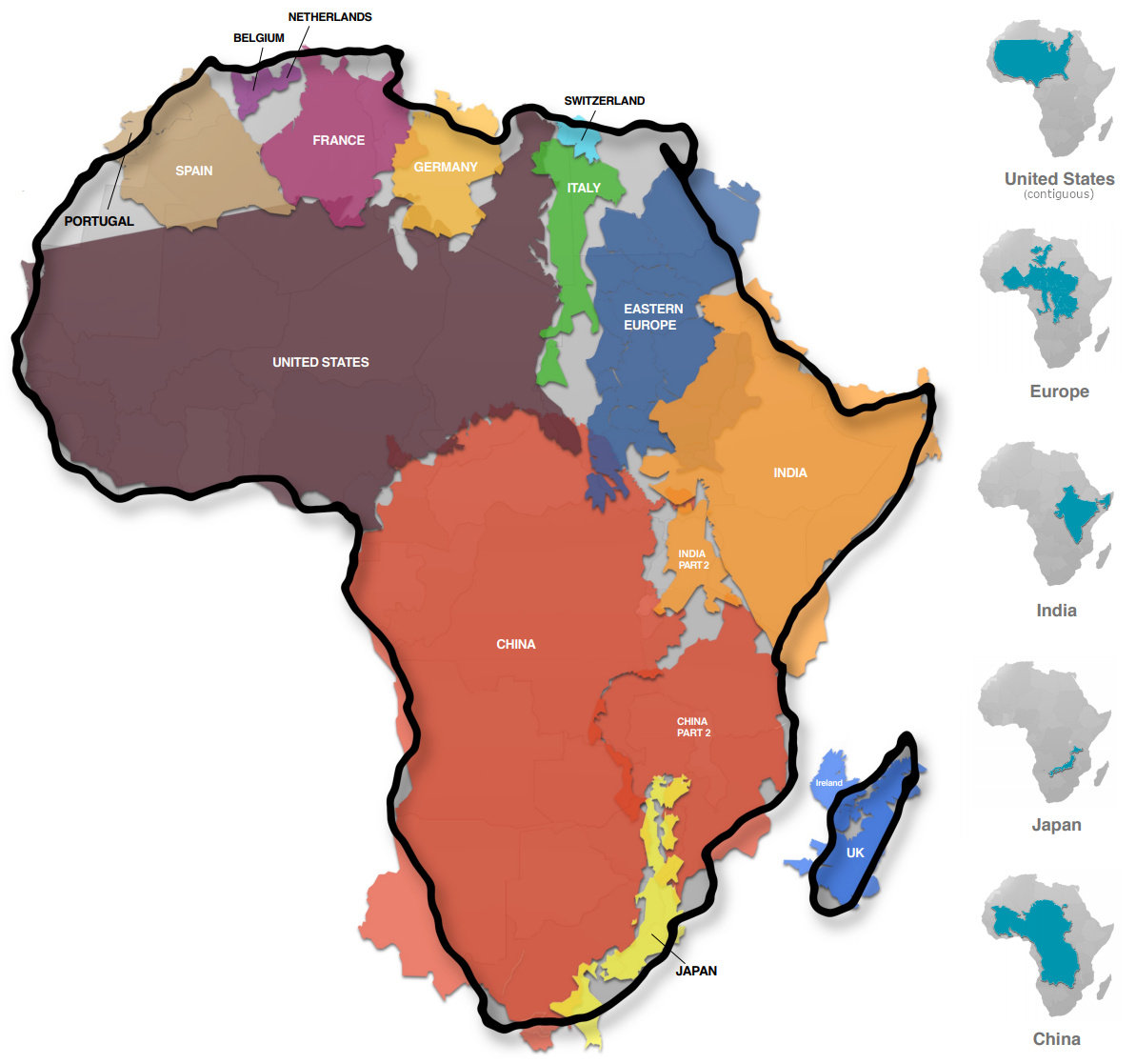
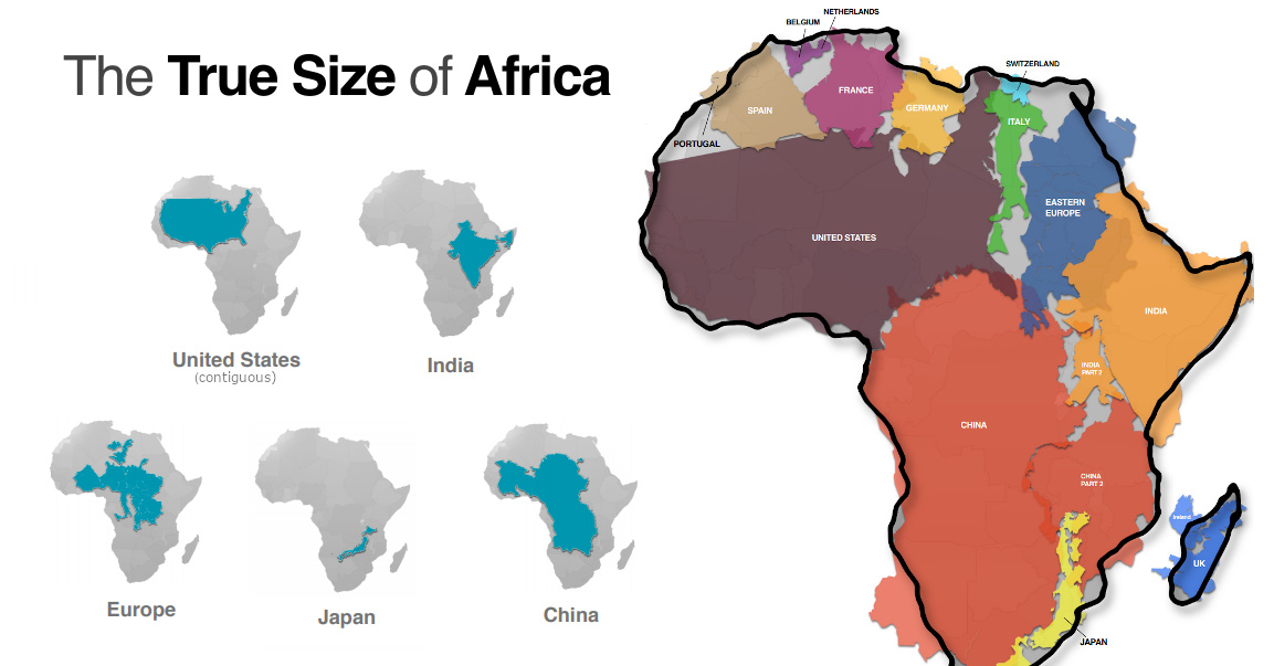
Mapped: The True Size of Africa
Take a look at any map, and it’s clear that the African continent is a big place.
However, despite the common perception that Africa is a large landmass, it’s still one that is vastly underestimated by most casual map viewers.
The reason for this is that the familiar Mercator map projection tends to distort our geographical view of the world in a crucial way — one that often leads to misconceptions about the relative sizes of both countries and continents.
A Geographical Jigsaw
Today’s infographic comes from Kai Krause and it shows the true size of Africa, as revealed by the borders of the countries that can fit within the continent’s shape.
The African continent has a land area of 30.37 million sq km (11.7 million sq mi) — enough to fit in the U.S., China, India, Japan, Mexico, and many European nations, combined.
| Country | Land Area (sq. km) | Land Area (sq. mi) | % of Africa |
|---|---|---|---|
| 🇺🇸 United States | 9.83 million | 3.80 million | 32.4% |
| 🇨🇳 China | 9.60 million | 3.71 million | 31.6% |
| 🇮🇳 India | 3.29 million | 1.27 million | 10.8% |
| 🇲🇽 Mexico | 1.96 million | 0.76 million | 6.5% |
| 🇵🇪 Peru | 1.29 million | 0.50 million | 4.2% |
| 🇫🇷 France | 0.64 million | 0.25 million | 2.1% |
| 🇪🇸 Spain | 0.51 million | 0.20 million | 1.7% |
| 🇵🇬 Papua New Guinea | 0.46 million | 0.18 million | 1.5% |
| 🇸🇪 Sweden | 0.45 million | 0.17 million | 1.5% |
| 🇯🇵 Japan | 0.38 million | 0.15 million | 1.3% |
| 🇩🇪 Germany | 0.36 million | 0.14 million | 1.2% |
| 🇳🇴 Norway | 0.32 million | 0.13 million | 1.1% |
| 🇮🇹 Italy | 0.30 million | 0.12 million | 1.0% |
| 🇳🇿 New Zealand | 0.27 million | 0.10 million | 0.9% |
| 🇬🇧 United Kingdom | 0.24 million | 0.09 million | 0.8% |
| 🇳🇵 Nepal | 0.15 million | 0.06 million | 0.5% |
| 🇧🇩 Bangladesh | 0.15 million | 0.06 million | 0.5% |
| 🇬🇷 Greece | 0.13 million | 0.05 million | 0.4% |
| Total | 30.33 million sq. km | 11.71 million sq. mi | 99.9% |
You could add together all of the landmasses above and they would not equate to the geographical footprint of Africa, which itself is home to 54 countries and 1.2 billion people.
Editor’s note: The above table is slightly different from the countries shown in the visualization, which focuses more on fitting recognizable country shapes into the geographical shape of Africa.
Why the Misconception?
Interestingly, the problem with maps is not that Africa is sized incorrectly.
Using the animation below, you’ll see that Africa is actually the most accurately sized continent using the common Mercator map projection:
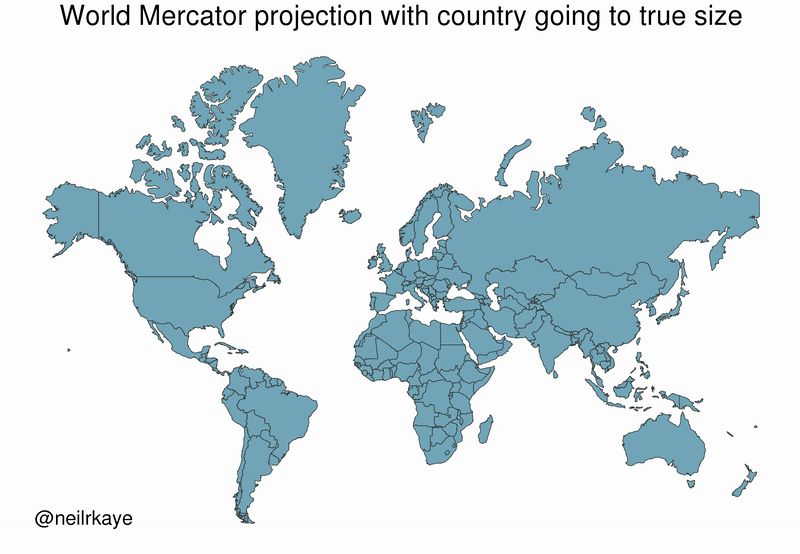
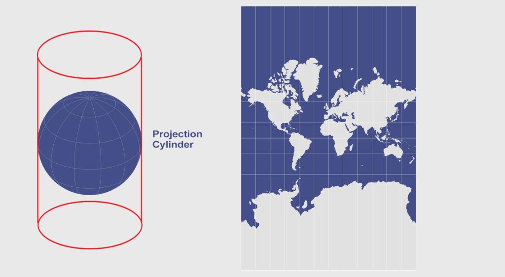
The Mercator projection attempts to place the spherical shape of the world onto a cylinder, causing areas closest to the poles to be “stretched”.
Africa, which straddles the Equator, barely changes in size — meanwhile, the countries furthest from the Equator become inflated from their true sizes on this type of map.
For those of us living in Western countries, this is an interesting dilemma to consider.
This means that the sizes of European and North American countries are distorted, giving us an inaccurate mental “measuring stick” for judging the relative sizes of other countries.
This has implications not only for Africa, but for the whole Southern Hemisphere: South America, India, the Middle East, and even Australia are “bigger” than they may initially appear on a map.


Politics
Charted: Trust in Government Institutions by G7 Countries
How much do you trust the government and its various institutions? We look at data for G7 countries for the time period of 2006-2023.
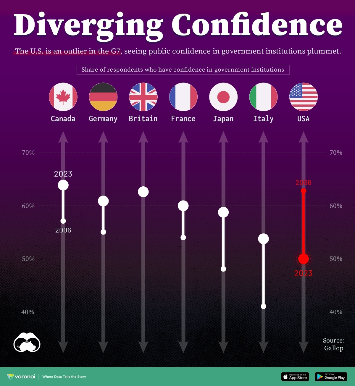
Trust in Government Institutions by G7 Countries
This was originally posted on our Voronoi app. Download the app for free on iOS or Android and discover incredible data-driven charts from a variety of trusted sources.
How much do you trust the government, and its various institutions?
It’s likely that your level of confidence probably depends on a wide range of factors, such as perceived competency, historical context, economic performance, accountability, social cohesion, and transparency.
And for these same reasons, trust levels in government institutions also change all the time, even in the world’s most developed countries: the G7.
Confidence in Government by G7 Countries (2006-2023)
This chart looks at the changes in trust in government institutions between the years 2006 and 2023, based on data from a multi-country Gallup poll.
Specifically, this dataset aggregates confidence in multiple national institutions, including the military, the judicial system, the national government, and the integrity of the electoral system.
| Country | Confidence (2006) | Confidence (2023) | Change (p.p.) |
|---|---|---|---|
| Canada | 57% | 64% | +7 |
| Britain | 63% | 63% | +0 |
| Germany | 55% | 61% | +6 |
| France | 54% | 60% | +6 |
| Japan | 48% | 59% | +11 |
| Italy | 41% | 54% | +13 |
| United States | 63% | 50% | -13 |
What’s interesting here is that in the G7, a group of the world’s most developed economies, there is only one country bucking the general trend: the United States.
Across most G7 countries, confidence in institutions has either improved or stayed the same between 2006 and 2023. The largest percentage point (p.p.) increases occur in Italy and Japan, which saw +13 p.p. and +11 p.p. increases in trust over the time period.
In the U.S., however, confidence in government institutions has fallen by 13 p.p. over the years. What happened?
Key Figures on U.S. Trust in Institutions
In 2006, the U.S. was tied with the UK as having the highest confidence in government institutions, at 63%.
But here’s where the scores stand in 2023, across various institutions:
| 🇺🇸 Institutions | Confidence (2023) |
|---|---|
| Military | 81% |
| Judiciary | 42% |
| National Government | 30% |
| Elections | 44% |
| Overall | 49% |
Based on this data, it’s clear that the U.S. lags behind in three key indicators: confidence in the national government, confidence in the justice system, and confidence in fair elections. It ranked in last place for each indicator in the G7.
One other data point that stands out: despite leading the world in military spending, the U.S. is only the third most confident in its military in the G7. It lags behind France (86%) and the United Kingdom (83%).

-

 Wealth6 days ago
Charted: Which City Has the Most Billionaires in 2024?
-

 Mining2 weeks ago
Gold vs. S&P 500: Which Has Grown More Over Five Years?
-

 Uranium2 weeks ago
The World’s Biggest Nuclear Energy Producers
-

 Education2 weeks ago
How Hard Is It to Get Into an Ivy League School?
-

 Debt2 weeks ago
How Debt-to-GDP Ratios Have Changed Since 2000
-

 Sports2 weeks ago
The Highest Earning Athletes in Seven Professional Sports
-

 Science2 weeks ago
Visualizing the Average Lifespans of Mammals
-

 Brands1 week ago
How Tech Logos Have Evolved Over Time