ArtSeen
Mark Rothko
On View
Fondation Louis VuittonMark Rothko
October 18, 2023–April 2, 2024
Paris
What will any of us say about Rothko in knowing how Ludwig Wittgenstein had once declared, “Whereof one cannot speak, thereof one must be silent.” What will any of us write about Rothko in knowing our words would fail even to come close to the extraordinary effect of the art itself? Those of us who have looked at and contemplated his work for years would concur with what his son Christopher Rothko has written about his father: “Rothko’s work, with its focus on the cycle of life and death, propels us unflinchingly toward the existential, a very uncomfortable place for most people to sit quietly.”

Sitting or standing quietly as I did on the two afternoons I spent in the Rothko exhibition currently in Paris. I did in fact feel deeply uncomfortable in front of Rothko’s work, from the very beginning to the very end. In order to write honestly about my feelings, I have to admit that I can only write about my approximate feelings and responses to what I saw and was able to absorb. This exhibition, a selection of 111 works, exquisitely and chronologically curated by Suzanne Pagé and Christopher himself, and spread across all the Fondation Vuitton’s ten galleries in three floors, traces the artist’s entire career: from his earliest figurative paintings to the abstract works that he is most known for today.
The first joyful experience was to have borne witness to his early works as we enter the first room of Gallery 1, with an elegantly built curved wall on which hung a judicious selection of a dozen pictures, painted during which time Rothko’s personal narrative as an immigrant may have coincided with the sentiment of the Great Depression in Greenwich Village, New York City, which was poignantly described by Malcolm Cowley in his memorable volume Exile’s Return: A Literary Odyssey of the 1920s (published in in 1934): “Better to seize the moment as it comes, to dwell in it intensely, even at the cost of future suffering.”
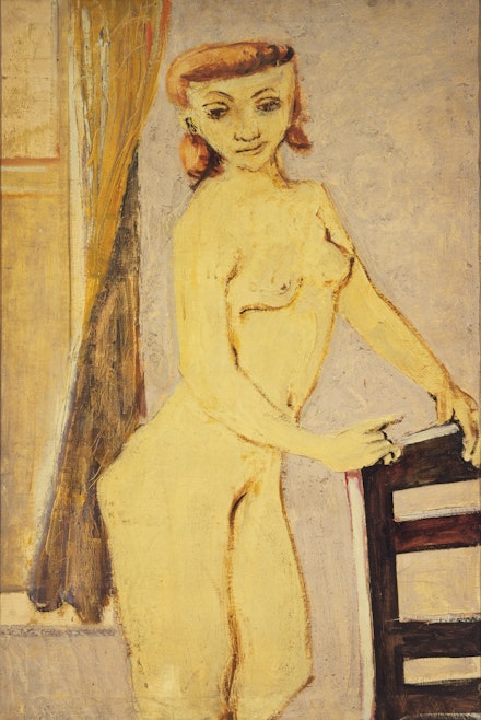
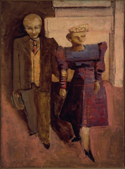
Still, as much as we may have felt the general aura in the first glance of how images were depicted in the manner of the prevailing style at the time, namely social realism, in which people were portrayed being subsumed by their dark, oppressive surroundings, as in Rothko’s subway pictures. Although these early paintings are often considered mostly as preludes to his later, abstract works, in prolonged viewing we see how agile and fierce he already was, and how experimental. I came to recognize that in every painting he made during this period, Rothko seemed to have consciously treated it as an individual experiment regarding both the alchemy of the painted surface as well as the image itself; and how the synthesis of painting technique and imagery seemed to evoke in full the artist’s inner life. In one instance, a 1938-39 picture of a Nude in an interior, leaning on a chair, the thickly painted predominant palette of light ocher and Naples yellow, mixed in with titanium white along with dark-brown brushstrokes irregularly painted for outlines, achieves a remarkably porcelain-like surface. In another, Family (ca. 1936), the painterly treatment of the three figures—mother, father, and their child—is consistently based on a network of soft touches, upon which particles of tonally diffused light pigments reveal different layers from below. Here, one suspects, unlike the heavy impasto of the applied paint in the former, the latter is softly applied to attain the artist’s desire for an equivalent of a sfumato effect. We realize that with many of Rothko’s early painted scenes, particularly with the subway pictures, even in the case of Untitled (The Subway) (1937), and Underground Fantasy (ca. 1940), the works weren’t just intended to impart his sympathetic feelings towards the socially oppressed, and his sometimes satiric commentaries on social and political situations from contemporary life at the time. Such paintings also reveal deep investment in exploring new pictorial inventions; as though Rothko already knew that, however awkward these pictures may seem in relation to traditionally-perceived-academic images, he was indeed creating an unbending firmament of his high goal, namely the possible reach towards the sublime through light and scale, and how they interact in relation to the painted surfaces and images, among other unnamable conditions. For example, in both pictures the similar treatment of the exaggerated elongation and simplification of the figures as vertical forms, and the way they are distributed equally with the steel beams, and the spaces in-between them, they function as structural surrogates that hold and join the metal ceiling on the top and the platform edge below. And along with Rothko’s interest in light and scale, what we see in these two pictures are the overt sensitivity calibrated to the flexible template of his struggle between organic and architectonic forms.

In the second room, we see that during WWII, Rothko’s work changed significantly. By quickly moving away from realism in favor of a new passion in mythology and surrealism, the artist was able to rekindle his youthful love for theater, especially Greek tragedy, as well as having been moved by Nietzche’s The Birth of Tragedy. But unlike Nietzsche, for whom the Dionysian element had to be balanced with a degree of Apollonian restraint, Rothko declared that his intention was to become the most Dionysian artist. As he once wrote, “I would like to say to those who think of my pictures as serene … that I have imprisoned the most utter violence in every inch of their surface.” It’s clear that the compression of time, through which the essential need to express basic human emotions, from tragedy, to ecstasy, to doom is a matter of urgency. However strange and deformed Rothko’s biomorphic hybrids of frieze-like forms are, they often appear in fragmentary components in three or more divisions of horizontal plane, which at times reference the figure overtly. For example, in Untitled (1941–42), we see multiple heads with large eyes and curly hair, depicted in frontal, profile, and three-quarter views on top; several views of torsos painted in the middle; hands intermingling with other quasi-figural shapes at the bottom. The same can be said of The Omen of the Eagle (1942) with one exception of its vertical format, and the multitudes of legs at the bottom in the fourth plan are in fact deployed as a pedestal of the above configuration. Other times, the degree of abstraction that demands the dispersion of kinetic energy, from the fragmentary to the whole for the sake of one unified experience, was inevitable, as seen in two of his masterpieces of this period: Slow Swirl at the Edge of the Sea (1944), and Rites of Lilith (1945). Again, as the supple and creamy light beaming across and through the two abstract personages, among other abstract gestures, while evoking a soft choral rhapsody in a celebratory spirit in the former, what appears in the latter is a complete deconstruction of what was just described, particularly the dismemberment of rectilinear forms, fluidly spreading across a dark, melancholic environment, painted in a key of gray with terrified layers of transparency.

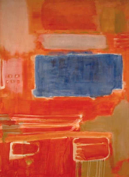
The most luminous moment takes place in Gallery 4, and Gallery 9, where we encounter as many as a dozen of what are referred to as the “Multiforms” series of paintings, which were all painted between 1945 and 1949. It was Rothko’s most decisive shift towards abstraction. From the disappearance of line or drawing, there emerged a large array of colors in unequal patches of high-key colors such as blue, red, yellow, and orange shimmering in different fields of muted colors, among endless other arsenals of gestures, created by brushing, dripping, dragging, blotting, staining, and spotting, as seen in Untitled: Abstraction Number 11 (1947), and Untitled (1948). What was especially important in these pictures was the artist’s keen investment in how edges are treated in relation to color and light that populates the field through the somewhat equal distribution of swirling forms, spurring a deliberate confusion between the relationship of figure and ground. Harry Cooper refers to these pictures being Rothko’s primordial soups—with all the ingredients already in there; all the artist needs to do is to stir them occasionally for perpetual new discovery. This approach is quite the opposite of what de Kooning had said: “Everything is already in art. Like a big bowl of soup. Everything is in there already, and you stick your hand in, and you find something for you. But every time you take something out, you must put something back.” Standing in front of Untitled (Multiform) (1948), I suspected that Rothko must have thought of Mondrian, who brought Cubism to its logical conclusion through the means of his unbounded architectural dynamism of the grid, which extends both his vertical and horizontal lines beyond the edges of the canvas, hence eliminating any framing device. The composition of this picture gives rise to the increased calibration of transparency in various colors as they hum their poetic sounds in subtle tonalities within the artist’s ambiguously adopted grid. In front of this picture I for the first time felt the depth of what he once said: “I became a painter because I wanted to raise painting to the level of poignancy of music and poetry.”
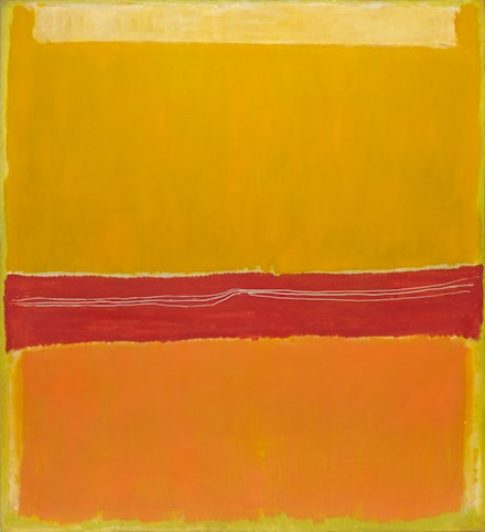
In these works, we are aware of absorbing the poetry of sound in each picture that transpires different spaces in different pictures—differently, say, from No. 14 (Golden Composition), (1949), No. 19 (1949) to No. 11/No. 20 (1949). There are subtle differences in what lies between their stratosphere and troposphere, regarding both the positive and negative temperature gradient in so far as degrees of dryness and moisture are concerned, became more visible as they migrated from a less recessive space to a complete frontal configuration—what were to be known as his “classic” paintings. Still, leading to the verge of total abstraction, Rothko retains his restlessness by constantly bathing his pictures with unending preclusions, which take their proliferations differently in each instance, according to his poetic temperature and musical arrangement. As I was staring at the four uneven rectangles with four color temperatures, hovering just slightly over its surface in No. 5/No. 22 (1950), for example, not only did I feel a sensation, heightened by the total effect of chromatic afterimage, but the rare appearance of the three irregularly scratched lines onto the red/orange band in the center seemed to suggest a string quartet of a music completely unknown to me. Moving to No. 18 (1951), I was elevated to a state of ethereal luminosity that I’d never felt before in front of a Rothko, especially with how the radiant white field, which populates more than half of the canvas below, was painted in all of its four edges. In this luminous painting, one fairly thin and jagged red line gently overlaps its top edge, while the other three edges from the left, the right, and the bottom seemed to have been applied with accumulations of thin layers of white pigment, which in turn created an evanescent vapor of clouds that is perfectly in concordance with another transparent white gesture painted over the red–blue band hovering right above. It was overwhelming in fact to have walked through so slowly, to feel both the subtle and bold ways in which light is orchestrated with such infinite variations. Just when we begin to assume, in these “classic” pictures, what Rothko may have felt—now having achieved the complete mastery over his technique and materials, where he could apply his “pictorial arsenals” onto most of his pictures—we, again, are thrown into endless circumstances of made spaces that have never been painted ever before. For each picture is made with specific conditions of human emotions, what the artist once referred to as “tragedy, ecstasy, doom and so on.” I felt an urgency to recall Hakim Bey’s concept of the “temporary autonomous zone,” where, by locating oneself in cracks and fault lines in the global grid of alienation, one can engender a specific rupture according to a specific condition to experience life in its maximum intensity. This was how I felt in every picture, be it the most intricately modulated in tonality in the spectrum of light—say No. 14/No. 10 (Yellow Greens) (1953), and No. 10 (1957)—or those in the spectrum of darkness, such as No. 3 (1957), No. 15 (1957), which reappeared in No. 8 (1964), Untitled (1964), No. 3 (1967), and Untitled (1967). Each has its own autonomous specificity of emotional content expressed through specific conditions of light.

Within this massive undertaking of such a magnitude, it was a miracle that in the two most important public artistic statements Rothko ever made during his lifetime, namely the “Seagram Murals” in Gallery 5, and the Rothko Room at the Phillips Collection in Gallery 7, the only two conditions that the artist was able to demand had to do with how each viewing experience of his work be installed in a way specific to the site, without extraneous variables. So when Rothko felt a strong aversion to having his pictures seen in the context of a dining room (regardless of its prestigious commission by the Bronfman family for their Seagram headquarters in New York, with Philip Johnson as a designer, and Ludwig Mies van der Rohe as an architect), he decided to withdraw from the contract, which eventually led him to offer these nine pictures, made between 1958 and 1959, to the Tate Gallery. Whether or not we perceive these pictures as precursors of the Rothko Chapel, the prevailing aura of brevity and depth is strongly conveyed through these conspicuously exalted and muted tones in a spectrum of reds and browns. Another most felicitous occurrence, from which the artist’s supervision was esteemed by Duncan Phillips’s pliable salute, whereby the four pictures he purchased were designated for a small intimate room (the first American museum to provide a dedicated space to the artist’s work) along with dim lighting to enhance the resonance of the colors, and a bench for prolonged viewing. The reinstalled version in Paris, with only three pictures on each wall (since Green and Maroon of 1953 is too fragile to travel), is perfectly installed: Green and Tangerine on Red (1956), Orange and Red on Red (1957), and Ochre, Red on Red (1954) look marvelous together.

In addition to the intense silence that the works in Gallery 6 demand, an especially marvelous moment is encountered in Gallery 10. In this specific installation, what was once conceived by the artist as a commission for a new UNESCO building in Paris, which never came to fruition, including Rothko’s eight pictures from his “Black and Gray” series, made between 1969 to 1970, are shown alongside three sculptures by Alberto Giacometti. As soon as we enter this gallery, we sense the solemnity of Rothko’s desire to elevate the level of “poignancy,” Here, we encounter in these pictures certain groundworks on which minimalism can be built upon the following decade of the 1970s, namely the reduction of the picture plane into two divisions: the pared-down color palette of black, brown, blue, and gray, all of which were revealed in the paint application on a white border, creating a clear distance from us to each picture, quote contrary to his previous work. It’s here that I felt the eerily emphatic confidence of a master who challenged himself at the end of his life by unleashing the profound paradox that lies between the restraint of meditation and the unbridled view of life’s hardship.

To demonstrate the artist’s nakedness, as the title of his son Christopher Rothko’s brilliant book (half memoir, half art criticism) indicates: Mark Rothko: From the Inside Out (published by Yale University Press, 2015)—what we finally see in the last three pictures of the final gallery, especially with Untitled (1967), where the larger red form presides over the orange field while swimming above the smaller region of black, which nevertheless appears to be frontal and concrete and unified. In particular, No.3 (Untitled/ Orange) (1967) seems to elicit a sublimity of light through an indescribable sense of colors that swell the mystery of infinity. It’s here that we come to a fuller understanding of Rothko’s monumental commitment to express the complexity of human emotions, not just his but ours. As Immanuel Kant asserted, “Whereas the beautiful is limited, the sublime is limitless, so that the mind in the presence of the sublime, attempting to imagine what it cannot, has pain in the failure but pleasure in contemplating the immensity of the attempt.” In the end, through an unending maximal materialization of light through color, whatever Rothko has discovered of his own truth and humanity, as a form of transcendental apperception, makes what lies inside revealed outward with a shared purpose of being human.
