
Did Alan Turing, the computer scientist and cryptologist of World War II inspire the APPLE logo?
Probably not. But, if you are familiar with his work and his life this would make a great urban legend. If you are not familiar with him, his biography will be posted tomorrow.
***********
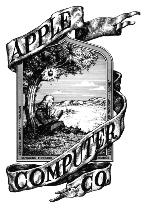
Beyond Apple’s epic legacy of innovative products lies an equally compelling history of corporate identity. The first Apple logo was designed by Steve Jobs and Ronald Wayne in 1976, featuring Isaac Newton sitting under an apple tree. It was inspired by a quotation by Wordsworth that was also inscribed into the logo that said: “Newton… a mind forever voyaging through strange seas of thought” with ‘Apple Computer Co.’ on a ribbon banner ornamenting the picture frame.
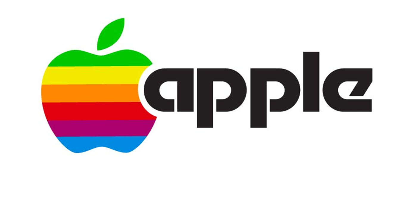
It was a good start, but in the end Steve wasn’t 100% convinced so in 1977 he commissioned designer Rob Janoff to focus more on the apple itself. Janoff did not disappoint, delivering the iconic logo we know so well, albeit a more colorful version dubbed the “rainbow apple” which was accompanied by a bold and modern font. This was done to commemorate the discoveries of gravity (the apple) and the separation of light (the colors) done by Isaac Newton and possibly to tribute the ‘fruit of the Tree of Knowledge’ in Adam and Eve’s story. Even the term ‘Macintosh’ refers to a particular variety of an apple of which Steve Jobs was fond. Living as a frugivore at the time he practically lived off apples.
The logo not only stuck, but provoked further speculation to its meaning by designers at the time. Some believed that the rainbow colored Apple logo was used to advertise the color capability of the Apple II computer. Others, like author Sadie Plant of Zeroes and Ones, considers the Apple logo as homage to Alan Turing, the father of modern computing, who was persecuted for his homosexuality and committed suicide by eating a cyanide-laced apple.
Since then the logo endured small iterations over the years. Landor Associates eliminated the wordmark in favor of the icon in 1984. It would later take on a stark black look in 1998, followed by more polished 3D versions and finally the flat/white or gray versions we see today.
The speculation has not stopped however. Apart from the symbolism of the logo some designers have visually analyzed the logo’s design. Probably one of the more interesting studies is by graphic designer Thiago Barcelos who applied the Fibonacci sequence, or Golden Ratio as the underlying structure of the logo. His work illustrates one of the more subliminal reasons why Apple’s brand has endured the test of time, despite its famously rapid pace of innovation. The folks over at Edible Apple Blog poked a bit of fun with this idea, creating a mockup of what current Apple products might look like with the old rainbow logo.
It’s incredible how far Apple has come since its humble inception nearly 40 years ago. Today few companies enjoy the enthusiastic fan base that Apple does, and it is clear that their visual prowess plays just as big a role in their success as the industry-shifting technology they are known for cranking out. It just hits home the importance of inspired marketing and presentation. Build the right brand and they will come.
Source: fineprintart.com

22 July 2023 at 01:02
Seems that there is clearly a very important person missing and clearly unaware of how to get himself out of trouble…he Served 14 years in all of the Technology grounds and he has not one. But 2 dedicated Group divisions named after him in Tailored Access Operations. It’s quite wild … S3233.. S3285..the Squirrel 🐿️ lost his nut. And the one who never was weak..now roams alone and homeless.
LikeLike