Skip to content
New issue

Have a question about this project? Sign up for a free GitHub account to open an issue and contact its maintainers and the community.

By clicking “Sign up for GitHub”, you agree to our terms of service and privacy statement. We’ll occasionally send you account related emails.

Already on GitHub? Sign in to your account

FR: showing read pages and read parts of a book #8426

Closed
poire-z opened this issue Nov 7, 2021 · 68 comments · Fixed by #8613
Closed

FR: showing read pages and read parts of a book #8426

poire-z opened this issue Nov 7, 2021 · 68 comments · Fixed by #8613
Milestone

Comments

@poire-z
Copy link
Contributor

poire-z commented Nov 7, 2021

(NB: Unrelated to the number of pages read we show in reading statistics.)

Rather a request for ideas.
A bit strange that I never wondered about this before - and that I've never seen such request among our issues over the years, so may be there is some existing solution/workflow to solve this, so tell me :)

Let's say I have a 3000 pages book with the complete WorkS of an author.
I don't plan on reading it linearly, and I may read parts (a Work, some chapters of a Work, random sections) depending on mood or references I meet in other books, etc...
There is currently no way to see what I have already read in the past, so I don't know if I have already read this section or not - and what I have yet to read if I somehow want to pick a random not-yet-read-as-I-want-to-finish-this-3000-page-book.
How do you people would handle this currently ? I don't see anything else available than just marking stuff with bookmarks or highlights. Do I miss something ?

Additionally, this 3000 pages book I got this thought with has a crappy ToC, so only marking/considering ToC items as read/not-yet-read would be a limited solution.

Some early thoughts if I'd want to implement something new to handle that:

  • we have our reading statistics plugin that remembers what pages I have read - so I think we could use this as the "what I have read" reference. No need to mark stuff manually. Would work with past open books.
  • showing read/non-read on the SkimTo widget on a 3000 pages book would be a bit hard to read and jump to sections + the SkimTo widget is already a bit crowded
  • thought about showing this in the ToC list, so we get some granularity by ToC item, that we can expand/collapse to zoom the granularity: we could show read/unread parts of the chapter either as an underline with thick/thin segments, or some background-color filler or diming the ToC item title. Long-press on a ToC item shows the full title in an InfoMessage: it could show an additional button that would launch a sub-SkimTo widget with read/non-read parts maked like non-linear fragments currently are, so you can jump across read/unread parts.
    image
    (pardon my mouse drawing skills)
  • I would also like to see on the Reader book page that this page has been read. I have no idea how we could indicate this: something like a bookmark dogear in another corner? A thick line on one of the page sides? Diming the whole page content?
  • How have people been handling this with paper books for years ? I have no idea, never needed to do that with paper books in my life :) May be there is some parallele with physical books solutions that we can just bring to our UI (like the bookmark dogear). Any idea ?

Any other thought or idea?

@Frenzie
Copy link
Member

Frenzie commented Nov 7, 2021

How do you people would handle this currently ? I don't see anything else available than just marking stuff with bookmarks or highlights. Do I miss something ?

I'd write it down either on paper or in Zim, or perhaps in my LibraryThing (private) comments.

How have people been handling this with paper books for years ?

You can also keep notes on your bookmark/piece of paper/post-it you stick in the book, put pencil checkmarks in the ToC, or just work with a million bookmarks.

(pardon my mouse drawing skills)

I don't know which program you used, but most should have some modifier like shift to draw straight lines easily, and omething like ctrl+shift to make them not only straight from start to finish but also completely parallel with the baseline.

@offset-torque
Copy link

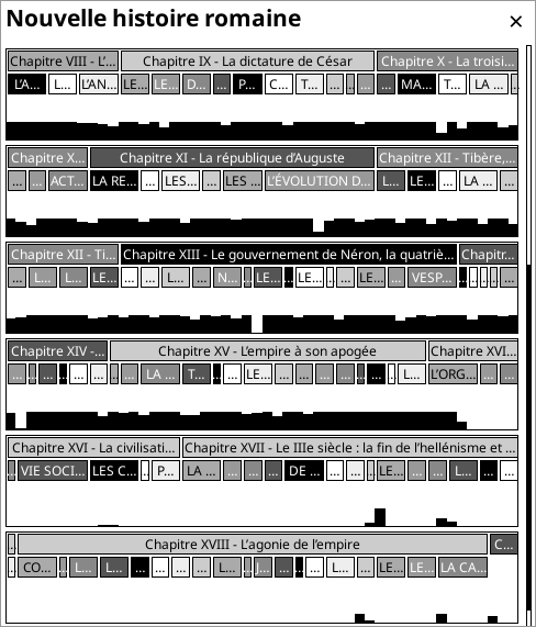
Yep I had this problem just recently. But didn't want to open an issue because I thought it might be a limited problem. So didn't want to waste devs' time for a personal problem (I am not trying to attack, no misunderstandings poire-z, really I didn't think other users may have this problem too).

In my case it was a collection of scientific papers about same topic, which was around 1700 pages on my reader. Normally you choose and pick parts that is relevant to you with this type of document. And you may want to return later for others. So marking would be very helpful.

Also another use case for this issue: BEST X OF THE YEAR (fiction/science-fiction/fantasy etc.) type of books which contains around 30 stories or anthology books which can have much more. Some people like to read these books non-linearly according to reviews (from best to worst or reverse). A kind of marking can be useful here too.

Now I thought a bit about a solution and came up with this:
When you go up to 3000 page range and sub-chapter granularity, only solution I can think of is a skim widget on steroids. Maybe a full page widget that resembles a disk defrag map as seen below.

In this image there is around 2700 boxes/pages for example (if I counted correctly), users can tap on pages directly. Empty boxes can be for unread, gray for read and black for chapter boundaries. Or this book map can even be divided by chapters (not in one continuous string I mean).

I am a visual type person so that is what I came up with. Just joining to conversation to spark ideas.

defrag

@Frenzie
Copy link
Member

Frenzie commented Nov 7, 2021

@poire-z
Copy link
Contributor Author

poire-z commented Nov 7, 2021

Maybe a full page widget that resembles a disk defrag map as seen below.

only solution I can think of is a skim widget on steroids. Maybe a full page widget that resembles a disk defrag map as seen below.

users can tap on pages directly. Empty boxes can be for unread, gray for read and black for chapter boundaries. Or this book map can even be divided by chapters (not in one continuous string I mean).

Oh, nice idea !
Extending this idea (edit: was all there :), we could have something a bit like the statistics calendar view:

imageimage
imageimage

With TOC items/chapters in these rectangles, with sublevels for subchaters on the 2nd and 3rd lines... + the little black squares (sectors) for pages read below them.
This would make this view multi purpose: an alternative view of the layout of the book and relative lengths of chapters, and also a view of what is read and how much and where !
I quite like it, and sounds fun to code.
Thoughts ?

@offset-torque
Copy link

Upon positive feedback I did some tests:

kobo_bigtoc

3 images from left to right:

  1. Little boxes showing pages as in defrag maps.
    NEGATIVES: Space between boxes and box borders creates overhead at small sizes like this. So not very efficient use of space and looks very crowded on device. Not a good idea.
  2. Logical iteration: Removing spaces so now we have a grid. It can show the whole book if it is around 500 pages.
    NEGATIVES: Not touch friendly, I noticed after transferring to device. Misclicks can happen frequently.
  3. Bigger touch targets. This is like the lower limit of touching casually I guess. ~100 px squares on 7" screen. Not very elegant but it has an advantage: It can show page numbers or other info in the boxes. Darker color can indicate pages with bookmarks for example.
    NEGATIVES: This one looks like sudoku or a calendar (but easy to understand and use)

So there can be two approaches:
Dense display Can show the whole book at once. But can't navigate directly. Also can't show page numbers. It is like a map of the book.
Sparse display Can show few chapters at once. Also acts as navigation / 2 dimensional skim widget

OR...
It maybe a combination of two. An overview map when you click on chapters that takes you to a zoomed in view of chapter. This might be harder to use because of back and forth between two modes. (And may be harder to code)

Full-size images are in the zip if you want to check on your device. I can make other mockups to try different suggestions. Photo of a sketch on paper is enough.

mockups.zip

@poire-z
Copy link
Contributor Author

poire-z commented Nov 10, 2021

we could have something a bit like the statistics calendar view
With TOC items/chapters in these rectangles, with sublevels for subchaters on the 2nd and 3rd lines... + the little black squares (sectors) for pages read below them.
This would make this view multi purpose: an alternative view of the layout of the book and relative lengths of chapters, and also a view of what is read and how much and where !

Not sure anybody got what I had in mind, so... from mind to code to screen :), it would give this:

image
One row = 50 pages. The height of a page slot is the time spent reading it vs. stats's settings max, so you could see which parts were harder to read or read more seriously.

With less grayfullness and some separation between pages:
image

I was quite excited, and thought this could be a new breakthrough in Table-of-contents-ology (which, to be honest, has been quite sleepy for the last 500 years :), and I would name this MoC (Map of Contents) or KoC (Kiosk of Contents) and license it to Amazon for a fortune !
But well, ToC, chapters and their lengths are so variable, that it's not as wonderful/readable/usable as I thought it could be :/

Some other ideas/thoughts:

  • pinch/spread horizontally to increase/decrease nb of pages per row
  • pinch/spread vertically to decrease/increase the nb of toc levels shown
  • the blackness of read page squares could depend on how long ago it has been read (so, stuff read recently would be black, stuff read 1 year ago would be lighter)
  • not sure how gestures/tap/long-press should be handled on this - but one thing I'm missing is Swipe down to get rid of it :) (because swipe up/down scrolls this view). I think it should stay a scrollable container - and not be page based (with rows split into pages, and chevrons at the bottom) so one can scroll the area he wants into view and not have some area of interest split on 2 pages.

With 100 pages per row and 1 toc level:
image

With 20 pages per row and 2 toc level:
image

A few samples from other books with different settings:
image

image

image

image

In some Bible, a way to see the relative lengths of the books - but you can't even guess the name of the short ones :/:
image

@offset-torque
Copy link

Some suggestions for legibility and user experience:

  • Cascaded boxes clutter the screen very much (I know this is just a prototype, just pointing this out)
  • I think each chapter should be on a new line. I understand the reasoning behind continuing them to make it look like a map. But on a 6-7" screen without colors, searching for chapter boundaries will end up with very poor user experience. Aim should be determining chapters "at a glance". We are already scrolling up and down, so no need to squeeze them together.
  • It is obvious that subchapter titles can't be reasonably/usefully shown. So a giant progress bar can show chapter boundaries and its READ status as in the mockup below.

Of course with this configuration user can't navigate to sub-chapters by name. But we already have ToC for that purpose.

tocmap

@poire-z
Copy link
Contributor Author

poire-z commented Nov 11, 2021

Misc thoughts about previous post:

Even if this FR is about showing read pages/parts of a book, if we get to a solution that is more generic and can show other info enough to help with other use cases, the better.
So, I'm now no longer thinking about it as just for seeing read parts. I think on each new opened book, I would launch this to see the map of the book and see what awaits (I usually don't look at the ToC on new books, so it's not something I need, but with such a visual overview, I may :)

You can't really trust the ToC level 1 items to be usable / valuable enough: except may be on novels where there is just a single level with evenly sized chapters. In the big books where we would need this, there are probably big level1 sections (ie. like on my Bible above: Old Testament / New testament where showing only these wouldn't be of much help and usability :) - and in Anthology kind of books where the sub Works can be arranged in a few sections: Articles, Essays, Poetry, and the ToC level2 items are where appears the real Works titles one would want to see - and I would also not mind seeing the level1 items so I know what kind of Work this level2 Work is).

But in my description above, I was suggesting that with pinch/spread, one could choose the level he wants to see, so I could get the "cascaded boxes" that makes sense to me/my context, and you could pinch to show only level 1 items.
We could even have a level 0 (if you pinch again from level1) that would show level 1 items each anchored on a new line/row.

I don't want to have to make any heuristics to be able to tag a chapter as fully read or partially read - which will inevitably be wrong in some contexts (type of chapter content, user reading habits).
I think it's best to just show the facts, and let the user visually appreciate them and draw its own conclusions. For example:

image
This has 2 pages unread, and 6 pages quickly read: should it be marked as partially read ? I don't think so: I guess (I know, the code couldn't) that there were some illustrations or tables, chronology, in this chapter that I just skimmed thru quickly and skipped. I can guess that from this display.
Also, most often the first page and last page of a chapter will have a few lines of text, and will be read quickly and possibly not accounted as read, so they will show as unread.

image
This one, I know from its look I just stopped reading this chapter :)

image
This one, I have not even partially read it: I must just have skimmed thru the book and stay a bit long time on some pages of it.

@poire-z
Copy link
Contributor Author

poire-z commented Nov 11, 2021

Policy question for fellow developpers (even if not interested by this topic):
For now, I started this with a menu item added to ReaderToc, and a new frontend/ui/widget/tocmapwidget.lua.
Do you feel this should be part of core ?
Or that it better be a (shipped) plugin as it might be a bit exoctic and people might want to disable it? Or that there could be some other similar "book map" feature with a different take/view - and then it's best to have each of them as a plugin to allow choosing one or the other, and to not add too much to core and menus?
(Both are possible, I don't see any technical difficulties either way.)

@Frenzie
Copy link
Member

Frenzie commented Nov 11, 2021

Core makes sense to me.

@hius07
Copy link
Member

hius07 commented Nov 11, 2021

Do you feel this should be part of core ?

Yes

@offset-torque
Copy link

Fair points poire-z.
As a data point: I think this has the potential to replace (in daily usage I mean) Skim Widget and/or ToC because of its information density (at least for me). With a carefully designed interface it would be usable/non-intimidating enough for average users to use this casually instead of those two maybe.

@poire-z
Copy link
Contributor Author

poire-z commented Nov 11, 2021

I feel the same (but for random/skip skimming, SkimWidget is better as it allows reading/moving while seeing the page - this book map widget being full screen, it would be open/close based - and ToC shows the longer/full titles, so it would stay quite useful).

because of its information density

If we'd want to be exhaustive (but exhausted and overcrowded), we could even show bookmarks/highlights with their symbols hanging from the page slots baseline :)

image
(This is a mockup with mspaint.exe, not sure I'd want to code that :)

I don't know which program you used, but most should have some modifier like shift to draw straight lines easily, and omething like ctrl+shift to make them not only straight from start to finish but also completely parallel with the baseline.

Unfortunately, Windows 10's screenshot tool does not have the feature, so you'll keep seeing my handmade clumsy lines :/

@poire-z
Copy link
Contributor Author

poire-z commented Nov 16, 2021

I would also like to see on the Reader book page that this page has been read. I have no idea how we could indicate this: something like a bookmark dogear in another corner? A thick line on one of the page sides? Diming the whole page content?

With a greasy fingerprint icon in the bottom of the right margin ! :)
image

@Frenzie
Copy link
Member

Frenzie commented Nov 16, 2021 via email

@offset-torque
Copy link

A thick line on one of the page sides

My vote is for this. Easy to check and at the same time doesn't clutter the page. Width in pixels can be configured to allow different bezel configurations.

One step further: It can be a dotted or dashed line so it won't fade in the shadow of bezel in different/low-light conditions. Same rationale as the yellow/black warning lines, one part visible in bright, other in dark conditions.

@poire-z
Copy link
Contributor Author

poire-z commented Nov 26, 2021

Worked a bit more on this, and went with hanging symbols for bookmarks and current position:

image

And, to my surprise, we can get a quite usable display when each chapter of a chosen level is anchored on a new line:

image

and we can have wider page slots when there are too many small chapters:
image

What's best depends on one's taste, but also on the book and it's TOC (mostly long or mostly small chapters, interesting chapter titles or not), and what ones wants from this new feature, which I hope is quite versatile and can answer various use cases.
Even if it's sometimes frustrating...

I won't say much more, because I'd like some of you to play with it without much info - because I want to know if how to use it is "discoverable" enough (there is no menu settings, and I feel it may not need any - but you'll tell me if you think otherwise). And you may get other ideas and suggestions when using it.

So, here's a zip with 6 update files, to unzip on a current nightly: book_map_wip1.zip
For the curious developpers, although not ready for code review: poire-z@bf9dd9b

Just a few notes:

  • no support for RTL UI yet (some not fun work I'll do at the end once we have settled on the look and behaviour)
  • no integration into multiswipes or gestures yet - it's available in the first top level as New: Book map, so a bit bothering to relaunch for now
  • any better idea than "Book map" to name this?
  • there is no pinch and spread gestures - because some devices don't have support for 2-fingers gestures - and I think we're just fine with swipes - so, it's all mostly swipes - that's what I want to know if it's discoverable/intuitive
  • the height and colors of page slots means something - I mentionned that above, so I won't again :) - is that understandable ? (and are you fine with the mostly "analog" heights ? Or should they be rounded to be "digital" and among 4 or 5 fixed heights, so it feels less free flowing ?)
  • not sure about what to make tap and long-press do (what a tap currently does is obvious, but it's so easy to tap unwillingly that it may feel bothering - moreover with small page slots and you can't tap precisely on a page)
  • what happens on long-press is some experiment, not spoiling it :) it surprisingly feels usable on my Kobo, so we may work on that (it needs quite some work) - but it might just be another gimmick (as this book map is already :)
    of not much usability.
  • (and still my bigger personal grudge with this: I can't use swipe down to close it - so I made swipe left/right close it... But now, on the other widgets like TOC, History and CalendarView, I unconsciously use swipe left/right ! which obviously don't close them... I'm quite bothered by this inconsistency... Any thought ?)

@yparitcher
Copy link
Member

Tried it a little, really like the general idea.

it crashes without.
local Menu = require("ui/widget/menu")

I also got a crash twice when touching the left slider back.

./luajit: frontend/ui/widget/bookmapwidget.lua:1100: attempt to index local 'row' (a nil value)
stack traceback:
	frontend/ui/widget/bookmapwidget.lua:1100: in function 'handleEvent'
        ...

It also does not handle screen resize well (what happens when i try the left slider on my touchscreen laptop)

Now for the UI :)

The hold feature is great 👍

the left slider is very hard to find, (i found it by accident) and hard to use on the emulator (did not test on device)
I only discovered the bottom slider from posting the screenshots and noticing the line on github :)
I think a snap-to slider of buttons would be better. the slider looks to be step based either way so maybe divide it into steps that are each buttons but if you swipe over the whole thing it will behave like a slider

Having the different levels is good:

In the Book ones, bottom of the slider, What metric is used to divide the lines? (It might be good to use some base metric of like 100 pages that will make it consistent between books) Also I don't think there should be white space for bookmarks if there are none it just breaks up the text and makes it hard to follow.
Reader_2021-11-29_225246 Reader_2021-11-29_225404

In the Chapter ones, looks good, Same white space comment as above.
Reader_2021-11-29_225512 Reader_2021-11-29_225525

@poire-z
Copy link
Contributor Author

poire-z commented Nov 30, 2021

Thanks for trying it ! and for the crash reports and feedback.

I would like a few more people to try it "naively" (even if not really interested by the feature), and get more feedback. Pinging @hius07 @zwim @Frenzie , could you please give this a few minutes (on a device, preferably)?

It also does not handle screen resize well

We have many many stuff that don't really handle screen resize well - so, I guess this will stay part of them :)

Some answers to @yparitcher comments - PLEASE DO NOT READ HIS POST OR THE FOLLOWING until you tried it (if you plan to, otherwise, read on)

I think a snap-to slider of buttons would be better.

What's a "snap to slider of buttons" ? :)

the left slider is very hard to find, (i found it by accident) and hard to use on the emulator (did not test on device)

Well, there goes my discoverability :/
I actually did not consider it as a slider or tapable thingy. The fact that it is thin and stuck to the edge makes it indeed unusable with tap.
Changing these parameters is implemented only via swipe, with the same zones as gestures's "One-finger swipe" "left/bottom edge swipe".
The gray sliders are not actually real widgets: I planned for them to just be visual hints that something is available on this edge ; you can't tap on them, so you will try swiping along them :) And I may as well show some scale on them.
But one thing I wanted is that, once you know about them, these "hints" shouldn't be visually bothering: I don't want 1cm on each edge to be wasted by buttons, which would be visually distracting. The fact that they are gray on gray sliders make them ignorable enough, but noticable enough when you care about them - and it actually works well with my mind :)

bottom of the slider, What metric is used to divide the lines? (It might be good to use some base metric of like 100 pages that will make it consistent between books)

Well, I settled on a min of pages per row of 10 (very large page slots), and a max when a page slot takes 1px.
On first launch, the pages per row (and so, page slot width) is computed so that all the book (in "book mode") fits on a page without scrollbars. I find this best to get an overall initial appreciation of the book ToC, from which you can update the settings to what feels best for "this" book. So, indeed, it's not consistent between books initially.

As for the bottom slider, I know it's a bit wrong, but my math sucks :) I'll request @zwim help (who I hope is the best of us at maths, with his calculator and autowarmth plugins :):
I think the way I handle swipes (* d or * 1/d):

        if direction == "west" or direction == "east" then
            local rel = direction == "west" and 1 or -1
            -- Have a swipe distance screen width do *2 or *1/2
            local ratio = ges.distance / Screen:getWidth()
            local new_pages_per_row
            if direction == "west" then -- increase pages per row
                new_pages_per_row = math.ceil(self.pages_per_row * (1 + ratio))
            else
                new_pages_per_row = math.floor(self.pages_per_row / (1 + ratio))
            end
            -- If we are crossing the ideal fit_pages_per_row, stop on it
            if (self.pages_per_row < self.fit_pages_per_row and new_pages_per_row > self.fit_pages_per_row)
                    or (self.pages_per_row > self.fit_pages_per_row and new_pages_per_row < self.fit_pages_per_row) then
                new_pages_per_row = self.fit_pages_per_row
            end

and the way I show the current position on the scale of min/max_per_row, with math.log:

    -- And paint a part of it in a darker gray
    -- (Somebody good at maths could probably do better than this... which
    -- could be related to the increment/ratio we use in onSwipe)
    local cur = self.pages_per_row - self.min_pages_per_row
    local max = self.max_pages_per_row - self.min_pages_per_row
    local dx = math.floor(h.max_dx*(1-math.log(1+cur)/math.log(1+max)))
    bb:paintRect(h.left + dx, h.top, h.hint_w, h.height, Blitbuffer.COLOR_DARK_GRAY)

are inconsistent. I would expect the slider to move the same with the same swipe distance whether we are near min or near max_pages_per_row. There's probably a right mathematical way to handle them similarly.

Also I don't think there should be white space for bookmarks if there are none it just breaks up the text and makes it hard to follow.

Which white space are you talking about ? The one in yellow or the one in blue ?
image

The one in yellow is to show read pages, from the data we get from the reading statistics db/plugins. So it is indeed blank on a new book - and gets filled with black page slots as you read on.
Do you have the reading statistics plugin disabled ?! Dunno what we should do in this case: remove that row ? But it's the single one you get when you are in the middle of the left slider (no TOC shown, which might be wished in some use case):
image
If I get rid of the yellow one here, I have nothing to show :)

And the blue one just to distinguish rows from each other - and additionally show the current page triangle (and bookmarks when there are any). Without it, we would get:
image

image

image

which feels a lot less readable to me.

The hold feature is great

Well, I'm still puzzled about it.
The thumbnail feels a bit small to read, so it just give a visual overview of the page, which might be enough for visual people to remember something about this page. And I would need to snap it in different corners depending on where you long-press, which would be unreadable in the bottom right corner, under your palm, if you long-press in the top left area :)
Or I would need to scroll the whole thing to the bottom to use the 2/3 top of the screen for a bigger thumbnail - but then, your long-press is no longer on the page you press....
Many usability issues.... so waiting until I get a better idea...
Also, twice, at some point, it wasn't showing anything (may be some fork() issue when the process takes too much RAM and fork fail...) - so it might end up unusable - possibly even more on Kindles with their limited free RAM...

@Frenzie
Copy link
Member

Frenzie commented Nov 30, 2021

@poire-z Ping me again on Thursday or Friday if I forget. I have to drive for some 5-6 hours tomorrow.

@zwim
Copy link
Contributor

zwim commented Nov 30, 2021

@poire-z : I will try it on Thursday morning.

@zwim
Copy link
Contributor

zwim commented Dec 1, 2021

@poire-z: I tried your zip in the emulator and get the following error: (Tapping on on the last entry in the first menu)

12/01/21-17:55:06 DEBUG setDirty fast from widget nil w/ region 5 366 530 42 
12/01/21-17:55:06 DEBUG refresh on physical rectangle 5 366 530 42
12/01/21-17:55:06 DEBUG Found font: NotoSans-Regular.ttf in ./fonts/noto/NotoSans-Regular.ttf
./luajit: frontend/ui/widget/bookmapwidget.lua:508: attempt to index global 'Menu' (a nil value)
stack traceback:
	frontend/ui/widget/bookmapwidget.lua:508: in function 'init'
	frontend/ui/widget/widget.lua:48: in function 'new'
	frontend/apps/reader/modules/readertoc.lua:652: in function 'onShowBookMap'
	frontend/apps/reader/modules/readertoc.lua:945: in function 'callback'
	frontend/ui/widget/touchmenu.lua:868: in function 'onMenuSelect'
	frontend/ui/widget/touchmenu.lua:192: in function 'handleEvent'
	frontend/ui/widget/container/inputcontainer.lua:263: in function 'handleEvent'
	frontend/ui/widget/container/widgetcontainer.lua:95: in function 'propagateEvent'
	frontend/ui/widget/container/widgetcontainer.lua:113: in function 'handleEvent'
	frontend/ui/widget/container/widgetcontainer.lua:95: in function 'propagateEvent'
	frontend/ui/widget/container/widgetcontainer.lua:113: in function 'handleEvent'
	...
	frontend/ui/widget/container/widgetcontainer.lua:113: in function 'handleEvent'
	frontend/ui/widget/container/widgetcontainer.lua:95: in function 'propagateEvent'
	frontend/ui/widget/container/widgetcontainer.lua:113: in function 'handleEvent'

@poire-z
Copy link
Contributor Author

poire-z commented Dec 1, 2021

Yep, that happens when you don't have toc_items_font_size set.
Here's an updated zip with this crash and another one fixed, and Book map added to Dispatcher, so we can assign it to a gesture (was tired of opening that menu :):
book_map_wip2.zip

@yparitcher
Copy link
Member

@poire-z
I tried it on my kindle so here we go :)
Definitely easier to use but:

> What's a "snap to slider of buttons" ? :)

buttons that you can tap on, but they also react to swipe gestures.

The sliders are annoying to get right with swipe gestures (i have the same complaint about the frontlight swipes etc.) I think they are good to have also for quick changes, but maybe also some way to exactly configure (menu/buttons etc.)

Which white space are you talking about ? The one in yellow or the one in blue ?

blue.
I don't know if we need to fully get rid of it, but if it is empty it should be smaller, also the chapter names in your last screenshot should have some sort of border to define them.

also why are some bars grey here?
f

@zwim
Copy link
Contributor

zwim commented Dec 2, 2021

Looks really, really neat :)

Perhaps one could add a legend for the various symbols (possibly with a button Show help or Show legend).
Especially if you use that only seldom.
There are triangles, bookmarks, highlights ... shown (and darker and lighter boxes).
I am sure I would forget the meaning of them after a few days not using it.

@poire-z
Copy link
Contributor Author

poire-z commented Dec 2, 2021

Looks really, really neat :)

Thanks :) Once you have played with it a bit, look at the "hidden" comments in the posts above, to see if you have "discovered" all the things discussed: if yes, was is intuitive enough ? if no, well... I hope you have :)

Perhaps one could add a legend for the various symbols (possibly with a button Show help or Show legend)

Yes, we could have a help text explaining all that is possible and how, that wouldn't hurt (long-press on the menu item, or some ? button near the close button.

@poire-z
Copy link
Contributor Author

poire-z commented Dec 3, 2021

@poire-z Ping me again on Thursday or Friday if I forget. I have to drive for some 5-6 hours tomorrow.

@Frenzie : pinging again :)

@Frenzie
Copy link
Member

Frenzie commented Dec 4, 2021

Going in blind, I don't like that swipe left/right closes it and I don't really understand what it's saying at first (needs a legend).

I think I understand what the sliding scale on the bottom does, but the one on the left seems a bit puzzling and hard to find. Maybe a little cogwheel in the top right or something, that offers you a few options in a radio dialog instead?

PS Wow, that's one polished prototype! :-)

@Frenzie
Copy link
Member

Frenzie commented Dec 16, 2021

Page flipping is only available with PDF I think - it might have some other purpose use case, so I'd rather like if we keep it :) (Not using it often, but I remember I liked it to zoom out and see the whole page - as a real whole page, unlike what we will get with my current work).

It is indeed useful for that. But I've never been much of a fan of the way the flipping works, even if it's quite clever.

@poire-z
Copy link
Contributor Author

poire-z commented Dec 17, 2021

So, readermap.lua is ok. But should it be readerbrowse.lua, "browse" sounds more generic than "map"?

I named it readermap.lua, but as, except for providing these 2 menu items, its main purpose is to provide a page thumbnail service/cache with ReaderMap:getPageThumbnail(page, width, height, request_id, when_generated_callback), something like these names might be better:

readerthumb.lua
readerthumbs.lua
readerthumbnails.lua

Which is the shortest that reads unambigously ? :)
https://wikidiff.com/thumbnail/thumb
thumbnail: (chiefly, computing) A small picture, used as a compact representation of a larger image.
thumb: (colloquial, Internet) A thumbnail picture. (but also (computing) The part of a slider that may be moved linearly along the slider. )
(what do "chiefly" and "colloquial" mean in definitions introductions?)

Another possible name for the 2nd widget: https://www.collinsdictionary.com/dictionary/english/thumb-through
(but from what I read around, "Thumb" or "Thumb through" to mean "turning page" is rather uncommon).

@Frenzie
Copy link
Member

Frenzie commented Dec 17, 2021

Thumb through may be a bit colloquial but I don't think uncommon is anywhere close to the right phrase. ^_^

@poire-z
Copy link
Contributor Author

poire-z commented Dec 17, 2021

(I knew that by asking 3 questions, I would as often get only 1 answer from you :) but this time, the way you worded it, I had a hard time even guessing which of my 3 questions it was an answer to :) but I guess it's to the 3rd !)
Any thought about the reader module name?

@Frenzie
Copy link
Member

Frenzie commented Dec 17, 2021

I knew that by asking 3 questions, I would as often get only 1 answer from you :)

I should probably use my phone less for the purpose, but I sometimes find it relaxing. 😊 It gets in the way of both typing and reading properly though.

Which is the shortest that reads unambigously ? :)

I'd probably go with readerthumbnail? I don't think thumb would be ambiguous in this context but it might be a bit unclear at first glance.

(what do "chiefly" and "colloquial" mean in definitions introductions?)

Colloquial means something like informal. You'd never put it in formal writing, you may not say it in formal speech, but you'd definitely use it among friends.

@poire-z
Copy link
Contributor Author

poire-z commented Dec 17, 2021

Thanks, I'll go with readerthumbnail.lua then.
Another vocabulary question :/
How would you name this thing in English: image

Working title is "ViewFinder" :) but that seems only related to camera.
This is supposed to look like a static bit of transparent glass/plastic as a layer above the map, and you would move the map below it, and what of this map is inside this area is what is shown zoomed in as thumbnails above.
The most "real world" thing/situation I can think of is in sea war movies, sailors in ships or submarines moving compass and rules on a big map of the ocean over a big table :)
I can't even think about a name for this in French - but I'll be fine with just an appropriate name in English :)

@Frenzie
Copy link
Member

Frenzie commented Dec 17, 2021

People older than me would be intimately familiar with a slide rule.

Something like indicator or pointer maybe?

@poire-z
Copy link
Contributor Author

poire-z commented Dec 17, 2021

Oh, nice find !

When this will come into KOReader, that's how people should apprehend this strange thing at the bottom :):
image

"Slide rule" sounds a bit obscure though, and I would need the name of this plastic part (slider ? but it's what would be static on our side, it's what's below that slides :)

"indicator or pointer" or "cursor" feels too "thin", usually meaning a point. I'd like something that evokes an area.

Would you be confused with "view finder" in this context, or would it be ok?

@Frenzie
Copy link
Member

Frenzie commented Dec 17, 2021

"Slide rule" sounds a bit obscure though

Everybody over a certain age had to use them in school. The Dutch/French name is a bit more self-explanatory though, being something like "calculator ruler" (rekenliniaal/règle à calcul).

@Frenzie
Copy link
Member

Frenzie commented Dec 17, 2021

Would you be confused with "view finder" in this context, or would it be ok?

I'm trying to remember what a similar concept is called in modern schoolbooks. You might also know it from the Maniac Mansion manual. There's this invisible text that shows up if you put a red-tinted bit of plastic over it.

@Frenzie
Copy link
Member

Frenzie commented Dec 17, 2021

I think viewfinder could work.

@offset-torque
Copy link

Reminds me microfiche readers

microfiche1

@Frenzie
Copy link
Member

Frenzie commented Dec 17, 2021

Modern ones use a computer program on a regular LCD screen to control lens and camera. The result is somewhat similar.

@solarkite
Copy link

solarkite commented Dec 17, 2021

I’ve been following the project. May I suggest “Skimmer”? Or “Skim Stats”

Edit: Ok. A skim function already exists. But, the results you’ve produced remind me of looking through a periscope. Maybe call it a “Stats Periscope” or “Statiscope”
84B7E0C4-3F23-4222-8229-5B6149FE7B2E

@poire-z
Copy link
Contributor Author

poire-z commented Dec 20, 2021

It started as a wish to see read & unread pages - but it ended up being a bit more, showing also chapters and bookmarks, and seeing page thumbnails - and it should work when stats are disabled.
So, its title shouldn't really mention "Stats" :)

@solarkite
Copy link

solarkite commented Dec 20, 2021

This could be a TOC "Punchcard chart" overlay with a TOC menu
("Content Periscope" menu option?) for varied stats to call up and view.
It would also utilize more screen space to visually dial in bookmark and note positions quickly when selected for.
Maybe a long-press on a bubble could bring up the Page browser view? What might even be very slick, Long-press a bubble to call up a thumbnail and slide your finger North South East West to a different bubble to change the thumbnail view?
Also, perhaps this TOC "Punchcard chart" ("Bubble Chart"?) navigation style could be used in order to quickly call up and read notes? (notes browser/reader?)
Additionally, this could also be a useful picture finder and viewer method. Footnotes, etc. Whatever is tagged on a page?
Much more ambitious perhaps, word locator and frequency heat map.
Content Periscope

TOC Periscope

@poire-z
Copy link
Contributor Author

poire-z commented Dec 20, 2021

Hold on :) You seem to follow up on the few initial posts - while this has evolved quite a bit from the initial ideas. See the screenshots in #8426 (comment) (your bubbles are my black squares, with an alternative grid view).
Many other things ended up as you're suggesting (tap bring thumbnail view, navigate thumbnails with swipes).
I'm nearly done and fed up with it, so please no more good design idea ! :) (except for the wording, but "periscope" feels a bit too poetic :) I'll have to pause this for 2 weeks, and will PR this early next year.

@solarkite
Copy link

solarkite commented Dec 20, 2021

Sorry, I"ll Chill.

@poire-z
Copy link
Contributor Author

poire-z commented Dec 20, 2021

No sorry needed, it's good to get ideas (and see that I'm not far off from what you would expect).

One remaining design point/question:
In the thumbnail view (screenshot in #8426 (comment)), there is no page numbers shown.
Do we need to show them ? Or are we just fine without as with this map/thumbnails, and everything being visual, page numbers don't really matter anymore ?
It's hard to put alongside the thumbnails because there may not always be enough room, or it may depend on the nb cols/rows and there may be room sometimes only on the side or above/below - and with PDF and variable native page sizes, this is not always consistent :/
Or they could be put inside the thumbnail like in https://images-na.ssl-images-amazon.com/images/G/01/us-kindle-content/PagFlip_eReader_670.gif , but I don't like possibly masking some content...
I could put them in the bottom "book map row", at the very bottom, every N page slots, but they may overlap with the hanging symbols, or I would have to put them when there is not symbol around, which could make them a bit randomly positionned.
Thoughts ?

@Frenzie
Copy link
Member

Frenzie commented Dec 20, 2021

(except for the wording, but "periscope" feels a bit too poetic :)

Perhaps "silent hunter"? 👼

@solarkite
Copy link

solarkite commented Dec 20, 2021

I read through your posts as you were solving for problems. Progressing to a two dimensional view made a lot of sense informationally.
Yes, more layers of info do tend to clutter the view. That's one of the problems I was trying to solve with the grayed bubbles. You can see the amount and location while easily seeing where that info is in the TOC for reference. Many people orient to a book using TOC. And TOC will never go away. Using an existing TOC option with extra info embedded made sense. And solves the inevitable menu clutter. (How does the user find it? Where does it go?)
Tapping a periscope menu to change information displayed could keep the clutter down.
Side note on the amount of information displayed: Would tracking a colleagues notes before you read the material be useful? Probably. Are people doing that? I don't know. If most ereaders were color, there would be handy way to solve that. :/
The page number reference marker challenge was also something I was trying to solve by using the TOC. The TOC becomes map coordinates and the finger drag is natural within that map.
Still, a user could benefit from page numbering each thumbnail as some users will navigate linearly. Before ereaders, I used to be able to remember what page number I was referencing.

@solarkite
Copy link

(except for the wording, but "periscope" feels a bit too poetic :)

Perhaps "silent hunter"? 👼

“Silent but Deadly-ometer”

@solarkite
Copy link

No sorry needed, it's good to get ideas (and see that I'm not far off from what you would expect).

@poire-z
I wish I had expressed my respect for your work. What you've done is really great and a difficult challenge.
With hesitation I submitted my suggestions to you because I recognized how much effort you had put into this passion project.
I ended up posting (at the risk of hurting your feeling. sorry. wish i had worded things differently) because i was hoping there would be value in my suggestions that could be integrated into the fine work you've done before the completion of the project.
While Using KOReader daily, I still feel daunted by the myriad of features that are not necessarily unified or simple to utilize. I was hoping to promote unity and simplification of features for a better user experience. No criticism was intended. I wish I could do what you do. Please, accept my warm wishes for a happy holiday!

@poire-z
Copy link
Contributor Author

poire-z commented Jan 3, 2022

OK, pushed what I ended up happy with in #8613.
Please see there for some other screenshots, comments and descriptions, and continue the discussion there, thanks.

Sign up for free to join this conversation on GitHub. Already have an account? Sign in to comment
Projects
None yet
Development

Successfully merging a pull request may close this issue.

9 participants