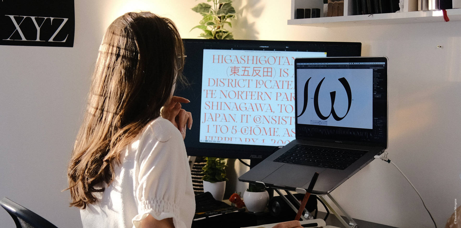
Paris-based graphic and type designer Morgane VanTorre’s flair for typography can be seen throughout her beautifully crafted portfolio of work. Having recently completed her master’s in Type Design at the École Estienne, she’s already created her own commercial typefaces, worked with dream clients such as freelancing with &Walsh, and had her work featured on platforms such as, The Brand Identity and It’s Nice That.
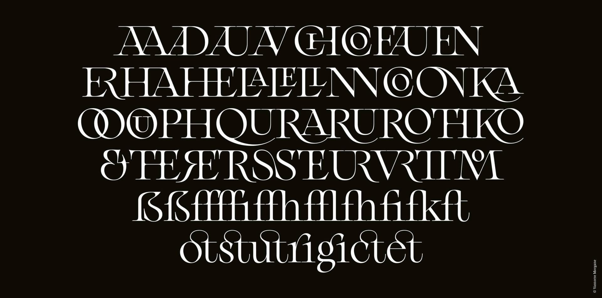
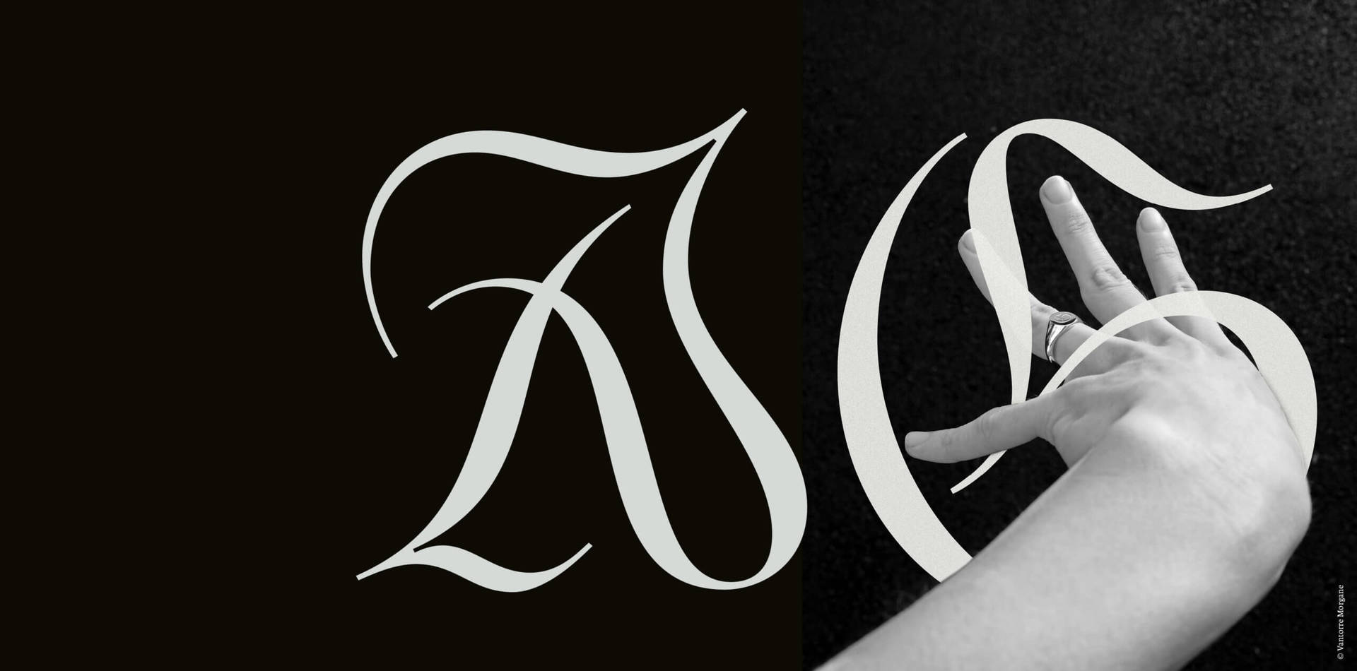
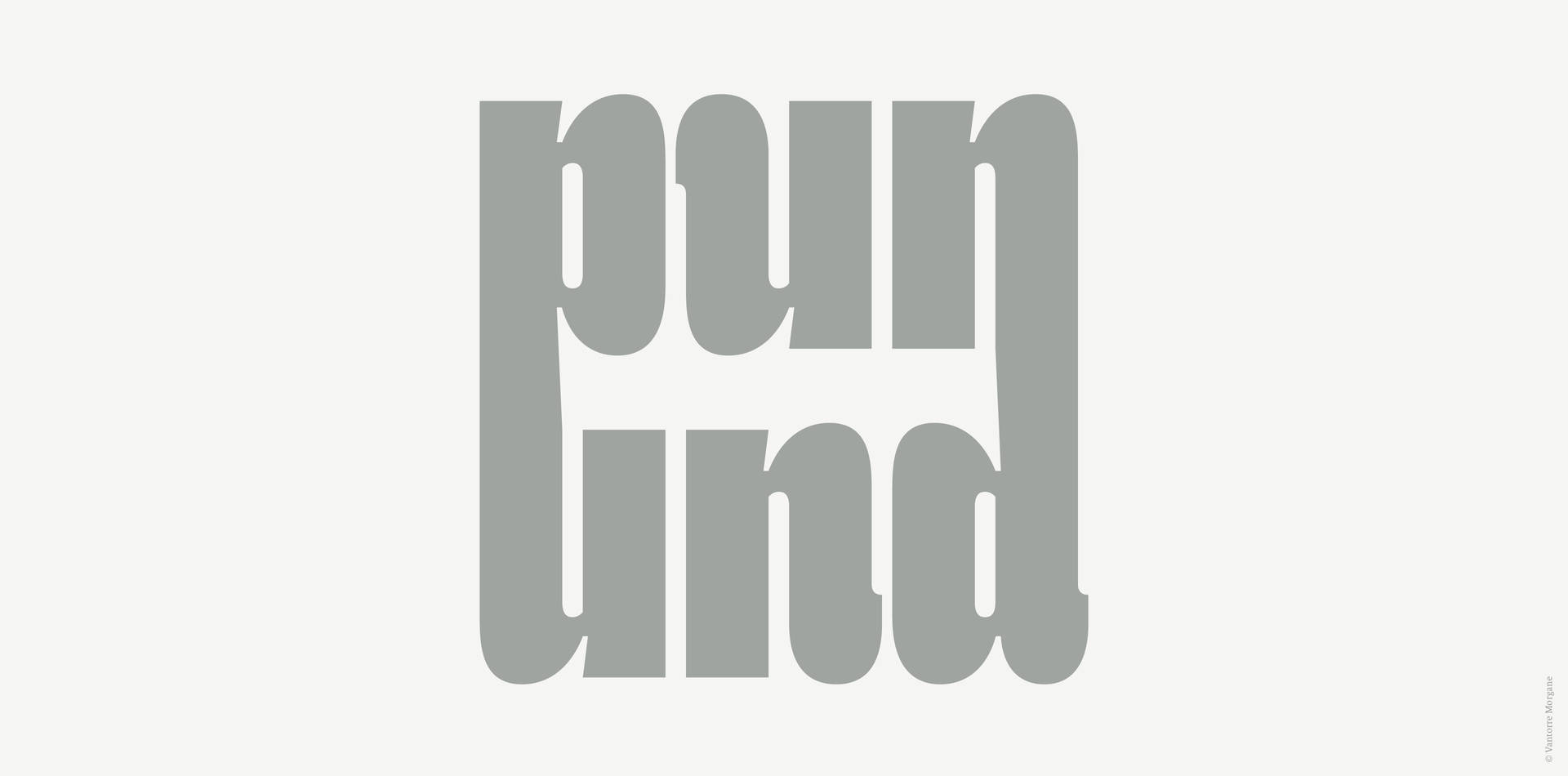
A collector at heart, Morgane loves discovering hidden gems in the world around her. Natural forms and the typography she comes across wandering through Paris are amongst the influences that inform her work. She is particularly interested in historical printed objects and books, and has drawn inspiration from 18th-century manuscripts, specimens, and cartographies to create the beautiful modern serif typeface Arthemys Display. She began working on Arthemys during her master’s program, and tells DbyW the project is, “like an experimentation ground where I’m free to play, to make mistakes, to start again, and to keep learning.”
Morgane places great importance on the theory behind design and takes a research-led approach to all her projects. The rigor and meticulousness of her process enable her to “understand the essence of the subject or aesthetic” and communicate her discoveries through the work she produces.
We talked with Morgane to find out more about what sparked her fascination with typography, the creation of her typeface Arthemys, and her evolving type design process.
You completed a master’s in Type Design last year. Where does your interest in type come from and what drew you to study typography in greater depth?
During my first two years of higher education in graphic design, I had the opportunity to experience an in-depth approach to typography. It was mainly through my semiotics professor at the time who taught me what written language really means and helped me to understand conceptually the characteristics of writing and what it can convey. I immediately found it fascinating.
Looking back, doing a master’s in type design was a logical next step. I’ve always been attracted to art, and my schooling was both literary and artistic. I think I’ve found in type design a meeting point between these two fields. It combines language and image, with creation at the heart of its approach. It is the combination of intelligent thinking and a sensitive approach that fascinates me.
“…my schooling was both literary and artistic… I’ve found in type design a meeting point between these two fields. It combines language and image, with creation at the heart of its approach.”
Can you tell us about your master’s project and why it’s important to you?
The Arthemys typeface project began in October 2019, just after starting my master’s degree. A desire to discover and perfect my letterform design skills was (and still is) what motivated me to follow this training.
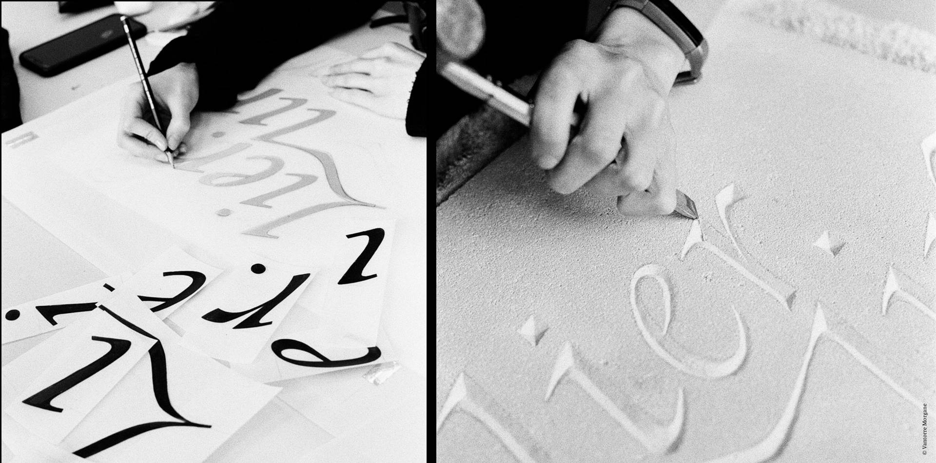
Starting out I used the software very naively but with a rigour of execution, which I quickly understood is essential to type design practice. Having some aesthetic ideas in mind – I have always been attracted to serif fonts with contrasting full and smooth strokes – I developed my research by drawing inspiration from the shapes I unearthed in manuscripts, specimens and cartographies from the 18th century. Real gold mines! From the outset, it was a question of relying on shapes that belong to what could be called an ancient typographic ‘canon’, while injecting my contemporary outlook and aspirations.
This project means such a lot to me because I continue to learn from it. It’s like an experimentation ground where I’m free to play, to make mistakes, to start again, and to keep learning. I aspire to develop the family as much as possible, the titling typeface as well as the working typeface, the italic, or even the bitmap. Arthemys also allows me to open up to other scripts such as Greek or Cyrillic. In short, it’s a project that allows me to approach my discipline from all angles.
You’ve already worked with some top studios, including &Walsh. How did this come about and what were your key takeaways from these experiences?
So far, I have never had to canvas for work. All the opportunities I’ve had so far have come directly to me, mainly through social networks and word of mouth.
These experiences have enabled me to develop in different ways; we all have our own way of working and organising ourselves. Being part of different teams and work processes has given me the opportunity to build my skills. I have acquired and continue to acquire rigor, organisation and strategy in my practice. Undoubtedly, these experiences have also allowed me to meet and exchange ideas with other designers and studios around the world. I always learn a lot from discussions and /or client feedback.
Where do you find inspiration for a new typeface design and how do you usually approach this kind of project?
My inspiration can come from anything around me: from street signs to books in my library, to packaging. I’m a collector at heart: I love to hunt for bargains and am looking to build up my own library of old printed objects. This is probably a legacy from my grandfather, who was a book-loving teacher and a history buff too! In general, I avoid looking for inspiration via social media, whether it is Instagram, Behance or Pinterest. These platforms are governed by algorithms that can lock us into a style and compartmentalise our creative freedom. I think this is also the open door to unconsciously replicating what is already being done currently. A good source of inspiration should take you away from current ephemeral trends.
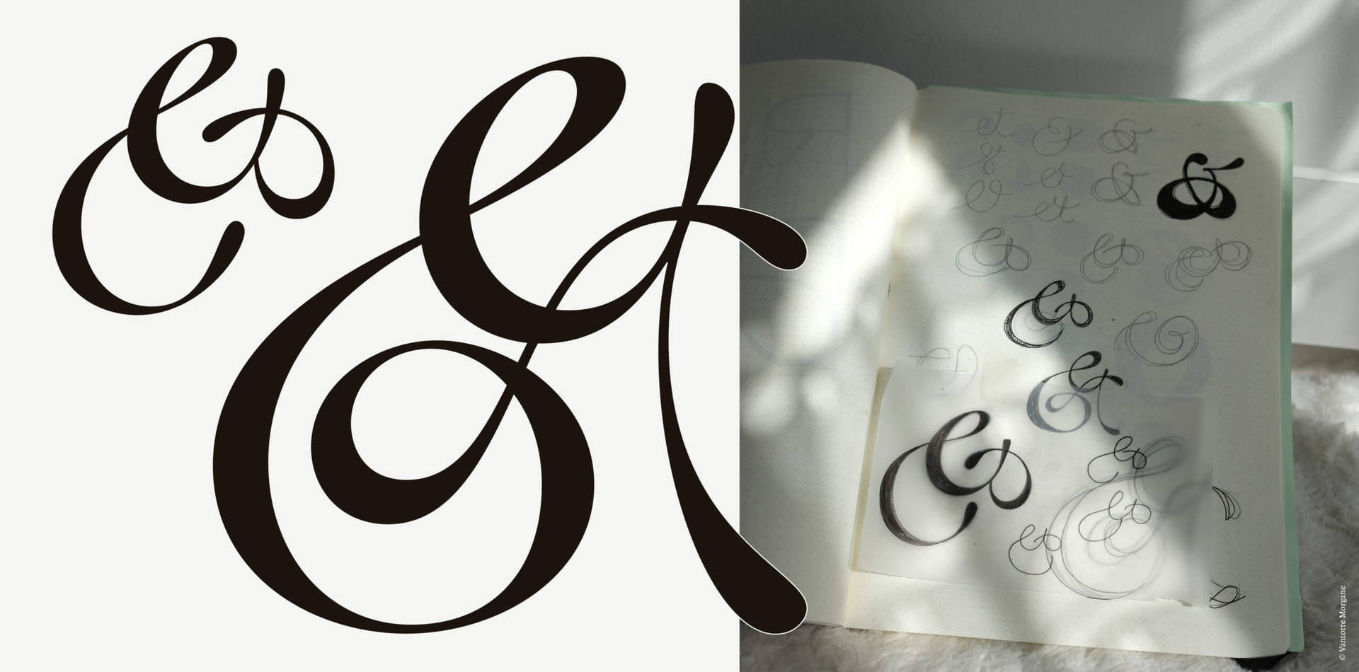
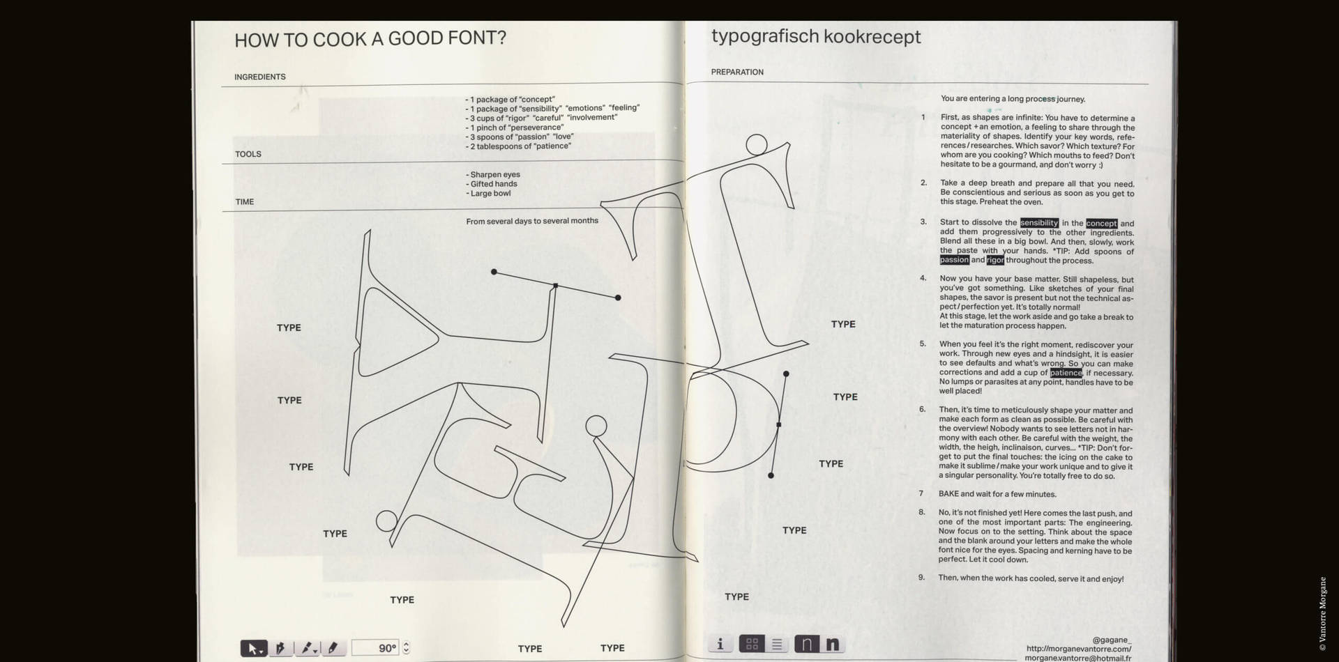
If I were to describe my approach to type design, I would say it is one of rigor and meticulousness. First, I place great importance on research because I need to understand the essence of the subject or aesthetic I am trying to achieve. I then draw in my sketchbook before completing the visual research, if necessary, through my books or image bank. Then it’s time for the software where, from the vectorisation of the drawing to the export, I carry out each step with precision. In the end, my objective is to be fully aware of what I am doing so that my design is not only beautiful but also well-crafted and usable by others.
“I’m a collector at heart: I love to hunt for bargains and am looking to build up my own library of old printed objects. This is probably a legacy from my grandfather, who was a book-loving teacher and a history buff too!”
You created the typeface Megh as your final degree project. Can you tell us about the meaning behind this project and the process you went through to create it?
This project is based on a sensitive experience that seeks to capture the ‘contact zone’ between the verbal and the visual in written language, while questioning our thinking about the space where thoughts come to life.
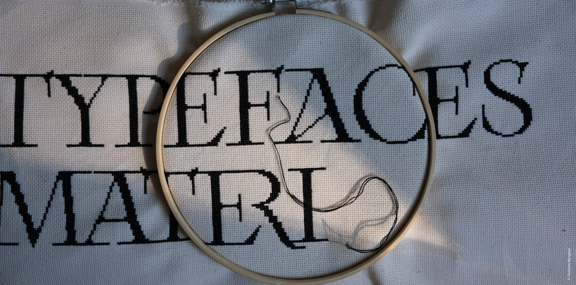
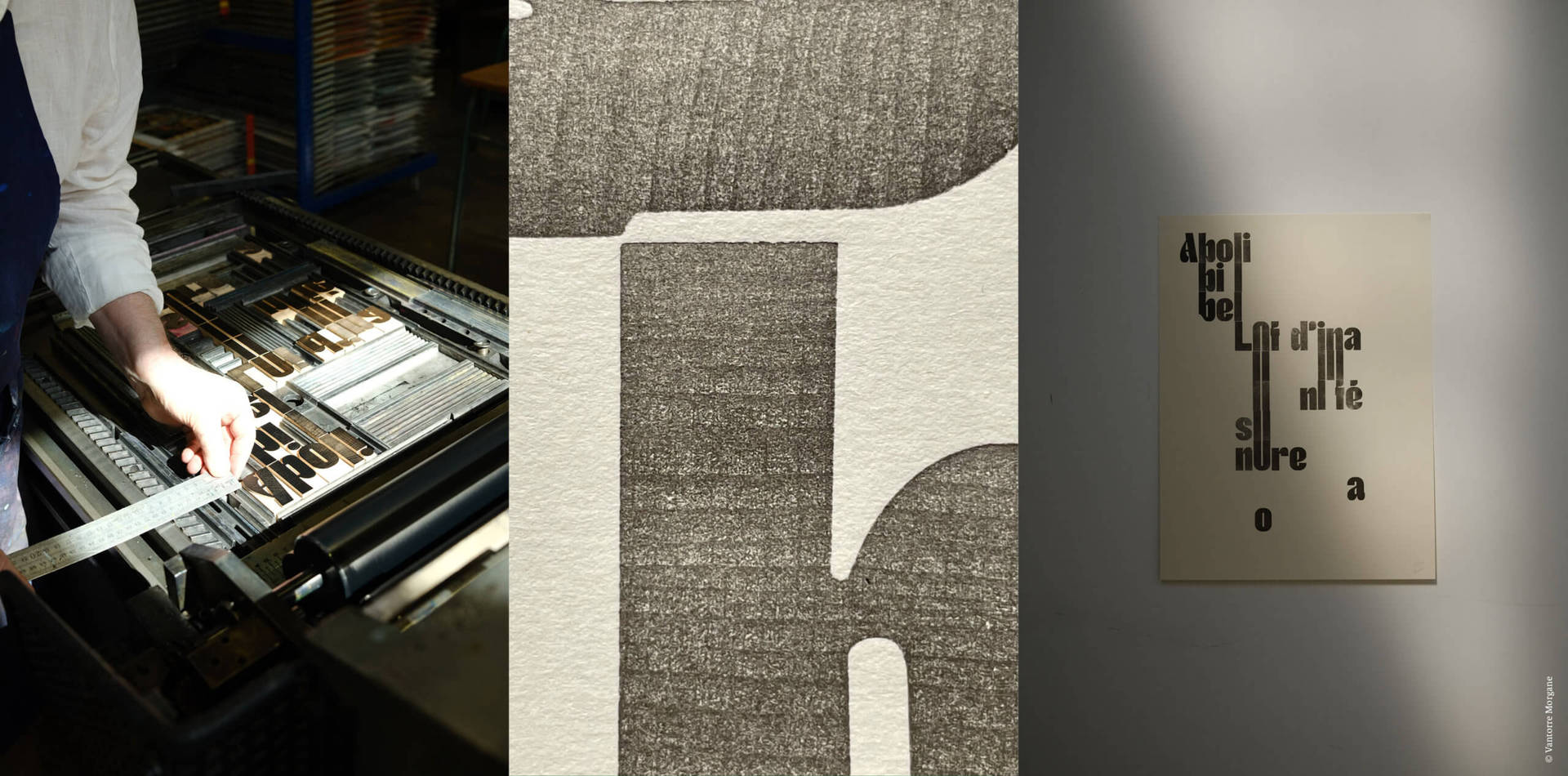
The idea for me was to interrogate typographic manipulation as a generator of forms/images and producer of meaning (intelligible and sensory) in order to visualise the complexity/combinatory richness of our language (linguistic & visual). Driven by a need to move away from screens and return to a tangible manipulation of language, I wanted to design a typeface both digital and wooden (in collaboration with British engraver Scott Cameron, @typehighdesign) whose rigorously drawn forms could give rise to multiple visual connections both horizontal and vertical. Megh, which is only in a beginning state, is a typeface that aims for a balance between metric rigour and the ‘poetry’ of form/material sensitivity.
225 pieces have been designed to be combined and associated with others in various ways and in all directions, to allow the arrangement of sculptural configurations in space. This activity was carried out by hand as well as with a typographic press, using a selection of texts by such great writers and poets as Georges Perec, Jacques Prévert and Stéphane Mallarmé that self-reference the act of writing. Tracing the entire chain of typographic design, my diploma ultimately seeks this jubilation, this candid/childlike apprehension towards the tools of our language and their manipulation.
In the future my ambition is to develop my approach and continue my formal wood experiments. It’s an incredible material!
“Megh, which is only in a beginning state, is a typeface that aims for a balance between metric rigour and the ‘poetry’ of form/material sensitivity.”
We not only love your typeface design but also your editorial work. How do you go about selecting typefaces for particular projects and layouts?
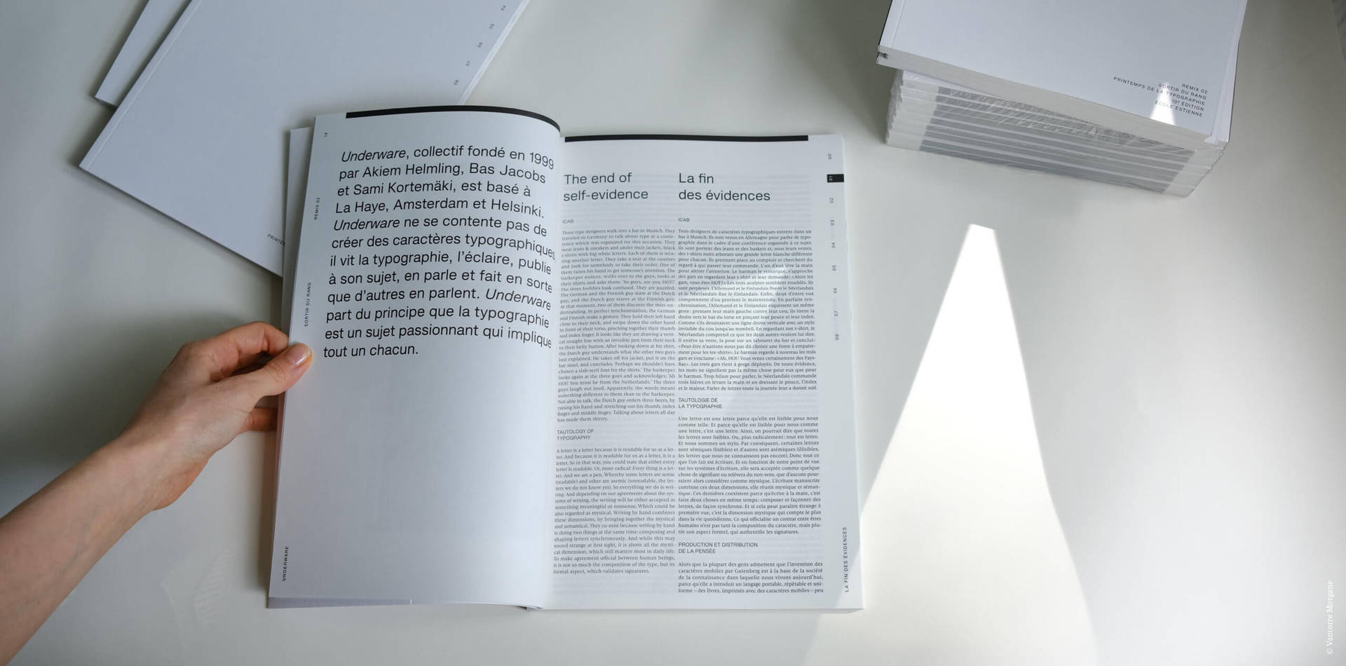
I love designing books. Editorial design projects require specific conditions for the choice of typefaces, taking into account the criteria of readability. Usually this is the first criterion that comes to my mind when selecting a typeface: eye height not too low in order to facilitate reading at low scale. At the moment, I like Karmina by TypeTogether or Savon by Fanny Hamelin. I also like Slussen by Hugo Jourdan (Blazetype) if I’m looking for a sans serif. By the way, I also like to contrast this aspect of readability by choosing an expressive typography for the titles and the cover or an expressive layout to surprise the reader and amuse their eyes.
What are you currently working on?
Currently, I’m a freelance type designer. I work independently on different projects for local and international clients and collaborate with studios or foundries such as LiftType or Pangram Pangram. On top of that, I also work on my personal projects – I’m currently updating Arthemys, enlarging the whole family and working on more typefaces to come.
I’m constantly working on developing my technique through professional experience or personal projects, having discussions, and sharing work with other designers. I’m always looking to get out of my comfort zone by experimenting with new forms and feeding myself culturally through visiting exhibitions and conferences etc.
Name your top three creatives currently working in the design industry.
There are many many women designers who I admire for their work.
I like Émilie Rigaud’s approach and can feel her passion through interviews and/or podcasts. I also appreciate the literary aspect of her work. Writing about our field is still rare and she motivates me to continue my research/theoretical writing on various typography-related topics in the future.
Marie Boulanger is also a good friend whom I appreciate for her authenticity, determination and hard work for Monotype.
Finally, I would like to mention Ines Cox who I’ve been following for a long time. I have always admired her poetic way of looking at the shapes of our world. I like the way she invites us to rediscover the simplest forms of our daily lives.
Thanks a lot for having me 🙂
Bests from Paris!
Morgane
Visit:
Follow:
- Instagram @gagane_

