Dead Kennedys is an American punk rock band. The band was founded in 1978, in San Francisco; at the moment it is rightfully considered one of the main pioneers of hardcore music of the 80s. Their work mixes the experimental techniques of 70’s British punk with the natural, raw energy of 80’s American hardcore punk. The band’s lyrics alternated with overtly shocking passages and satire that caustically mocked the vices of the social and political order in Reagan-era America.
Meaning and history
The Dead Kennedys band was formed in 1978. The original Dead Kennedys consisted of Jello Biafra (real name Eric Boucher) on vocals, East Bay Ray on guitar, Klaus Flurid on bass, and Bruse Schlesinger on drums. As early as June 1979, the Dead Kennedys released their first single, titled CaliforniaUberAlles. This single was recorded on the band’s label “AlternativeTentacles”, which is still owned by Jello Biafra.
In 1980, they released Fresh Fruit for Rotting Vegetables, a record containing some of the band’s best songs. In 1981, Darren H. Peligro became the drummer, and with this lineup, the Dead Kennedys recorded In God We Trust Inc. and in 1982 they re-recorded and released songs from their first record.
In 1985, the record “Frankenchrist” appeared. One of the songs, “MTV Get Off The Air,” became famous again. In 1986 the Dead Kennedys released the record “Bedtime For Democracy”, and in 1987 they released the compilation “Give Me Convenience or Give Me Death”.
In 1986 East Bay Ray left the band, so they didn’t perform in 1987, and the last record was produced by one Biafra. He didn’t leave music and played in a few more bands after DK. He also recorded spoken word records and gave all sorts of speeches. It had nothing to do with punk rock anymore.
A few years later the Dead Kennedys got back together in their original lineup, only Jello’s place was replaced by Brandon Cruz. They stepped away from politics and did their best to restore and preserve the original DK sound.
DK sang very angry and harsh, sarcasm-ridden political songs against the domestic politics of America at the time. Jello Biafra mocked everyone as much as he could, and even the name “Biafra” has a caustic political connotation – it is the name of a small African country that was blockaded by England and America, after which almost its entire population starved to death.
What is Dead Kennedys?
Dead Kennedys is one of the most famous punk rock bands in history, a hardcore punk band from the United States that was active in the 1980s. The band is also known by the acronym DK. The Dead Kennedys’ work has influenced many contemporary punk bands.
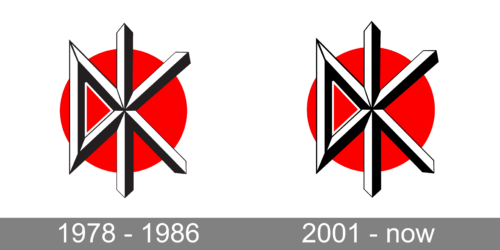
In terms of visual identity, Dead Kennedys is a very stable band. Their official logo has been with DK throughout the whole history of the band, as it perfectly represents the philosophy and music of Dead Kennedys, and today is considered to be one of the most iconic logos in punk music.
1978 – 1986
Even though the logo of Dead Kennedys looks pretty minimalistic, and may seem just a designer creation, it has a lot of meaning in it. The badge represents everything, that is important for the band and points out all the aspects, which influenced the DK music.
The logo is composed of a solid red roundel, which symbolizes “A Problem”, targeted by the musicians in their songs; and a stylized black-and-white “DK” abbreviation, placed over the roundel. The lettering is formed by several straight bars in black and white, looking like the blades of the swords, or nails. These bars represent the sharp lyrics of Dead Kennedys, and their edgy humor and irony, pointing out all the imperfections of the system.
2001 – Today
After the band’s come back in 2001, Dead Kennedys kept their iconic logo, only slightly refining its contours and strengthening the lines. It was still the same band, the same music, and the same philosophy, so why change their recognizable signifier?
Font and color
The Dead Kennedys logo does not have any wordmark on it, just the stylized abbreviation, drawn in thick geometric lines, hence there is no typeface to identify. As for the color palette of the punk-rock band’s visual identity, it is based on a powerful and intense tricolor of black, red and white, where red is a symbol of aggression, power, and danger, black stands for fight and strength, and white — for loyalty.


